C-Counter - a calorie tracking app
This isn't just a list of screens. It's the story of how someone opens the app knowing nothing about calories, and within a few minutes ends up with a plan that feels personal.



1year
Launch time
207
Number of screens
2M+
Meals recognized by AI
94.6%
Food recognition accuracy
Below is the full journey, step by step, with screens, some 'why' along the way, and a few UX decisions worth calling out.
Greeting & quiz intro
The very first touch with the app - and there's no form, no questions. Just a short welcome and one honest promise: 'snap a photo of your food, and it's all under control.' It takes about five seconds, not five minutes of filling out a form, and the person already understands why they need this app. Right before the quiz starts, the app stays just as upfront: a few questions are coming, but they're for building a personal plan, not for collecting data.
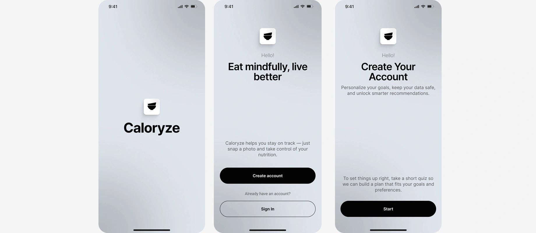
When people understand the purpose of the steps ahead of time, they're less likely to abandon the process halfway through - a small detail that does a lot of work.
Personal & adaptive quiz
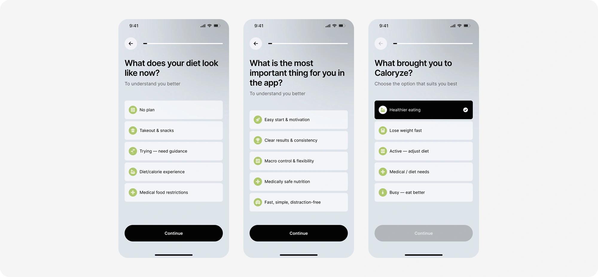
The first questions explore the person's motivation and habits - the foundation for everything that gets personalized later. From there the quiz starts adapting to the person: questions read like a caring conversation ('what exactly brought you here?') rather than a bureaucratic form, and the progress bar at the top always shows how much is left, which removes the anxiety of not knowing 'how much longer?' A few answers in, the plan stops feeling generic and starts feeling like 'mine.'
Personal parameters & goal
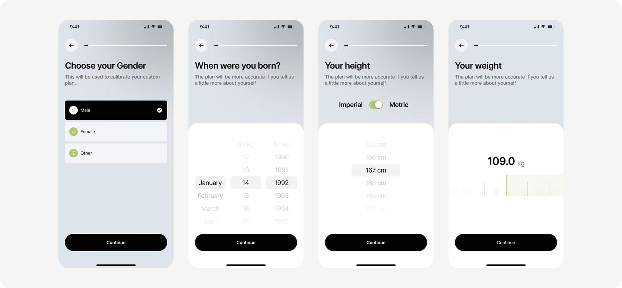
Height, weight, age - dry numbers, but shown one per screen in large type, so it never feels like a medical intake form. Then comes a small piece of magic: as the person types in their desired weight, the app instantly shows the difference in kilograms. That immediate feedback turns entering a number into a conscious choice - the person sees the scale of their goal right away, instead of guessing it after the fact.
Plan generation & subscription
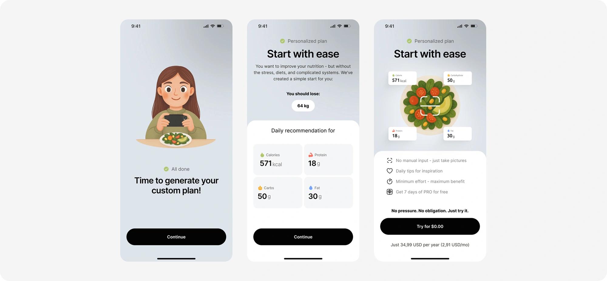
Transitional screens let the person know their personal nutrition plan is being put together based on their answers and only once that plan is on screen does the paywall show up. That order matters: the trial offer arrives after the person has already gotten value, not before. A 7-day free trial and a clear list of benefits cut down the feeling of 'being sold something' - it's obvious what you're actually paying for.
Sign up & sign in / data sync
A standard authentication flow: sign up, sign in, password recovery, and the loading states in between.
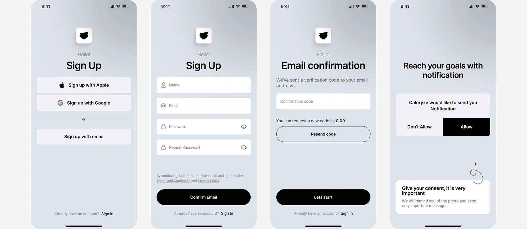
Right after, a short transitional screen syncs the quiz answers with the user's profile before dropping them into the app itself.
Home page
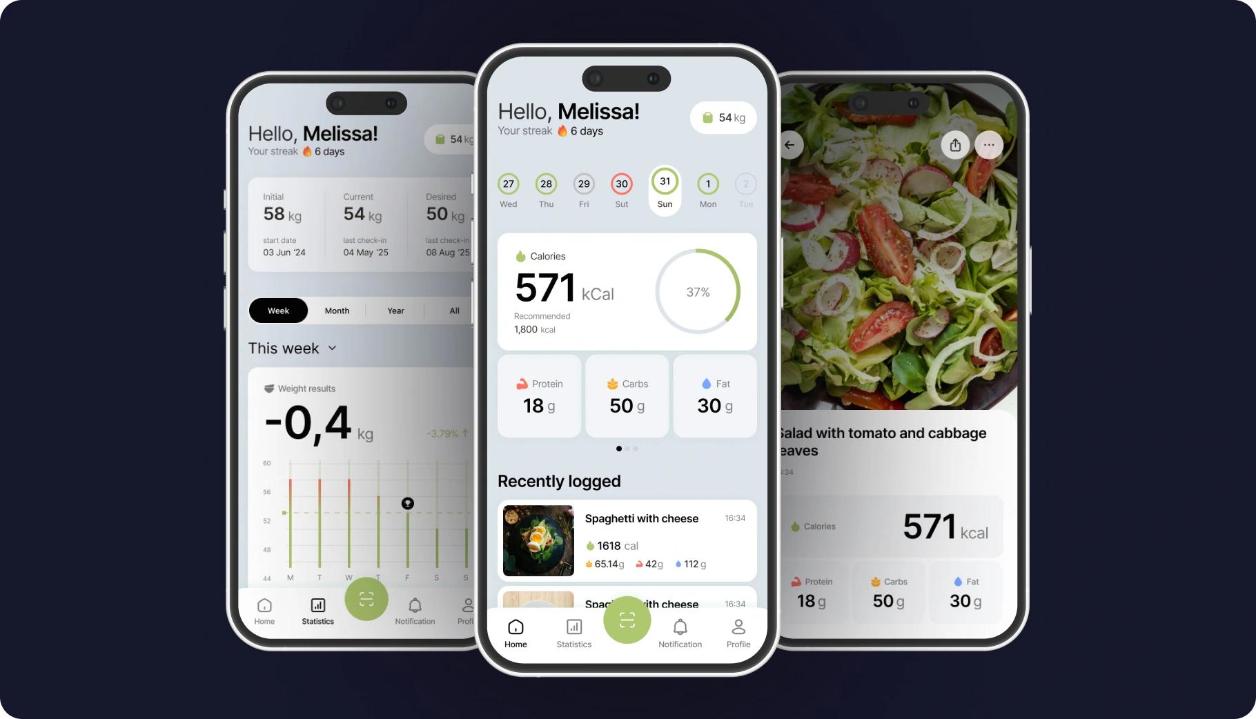
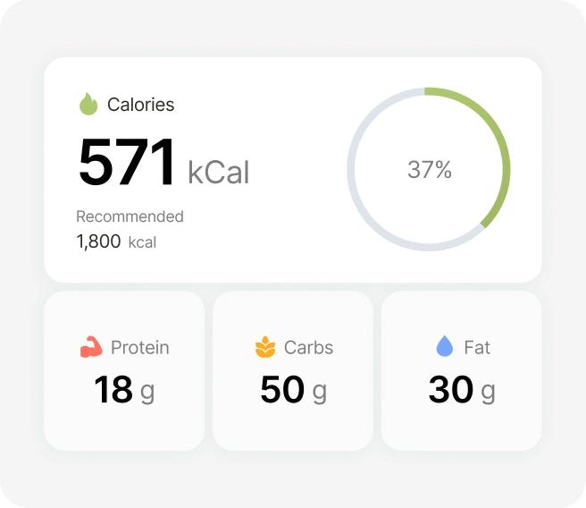
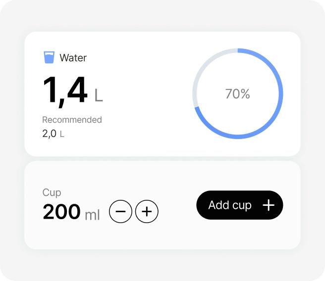
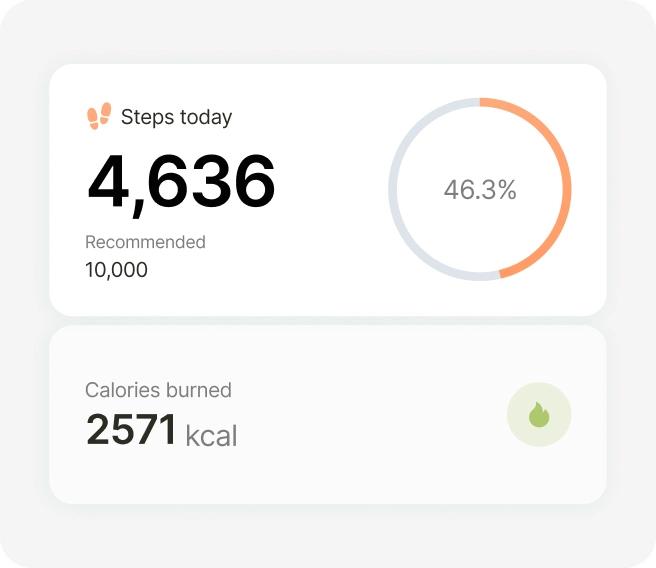
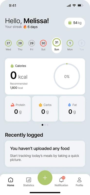
The home screen answers one question in a second: 'how am I doing today?' A calorie ring, a daily streak, and macro cards - everything you need, with no extra scrolling.
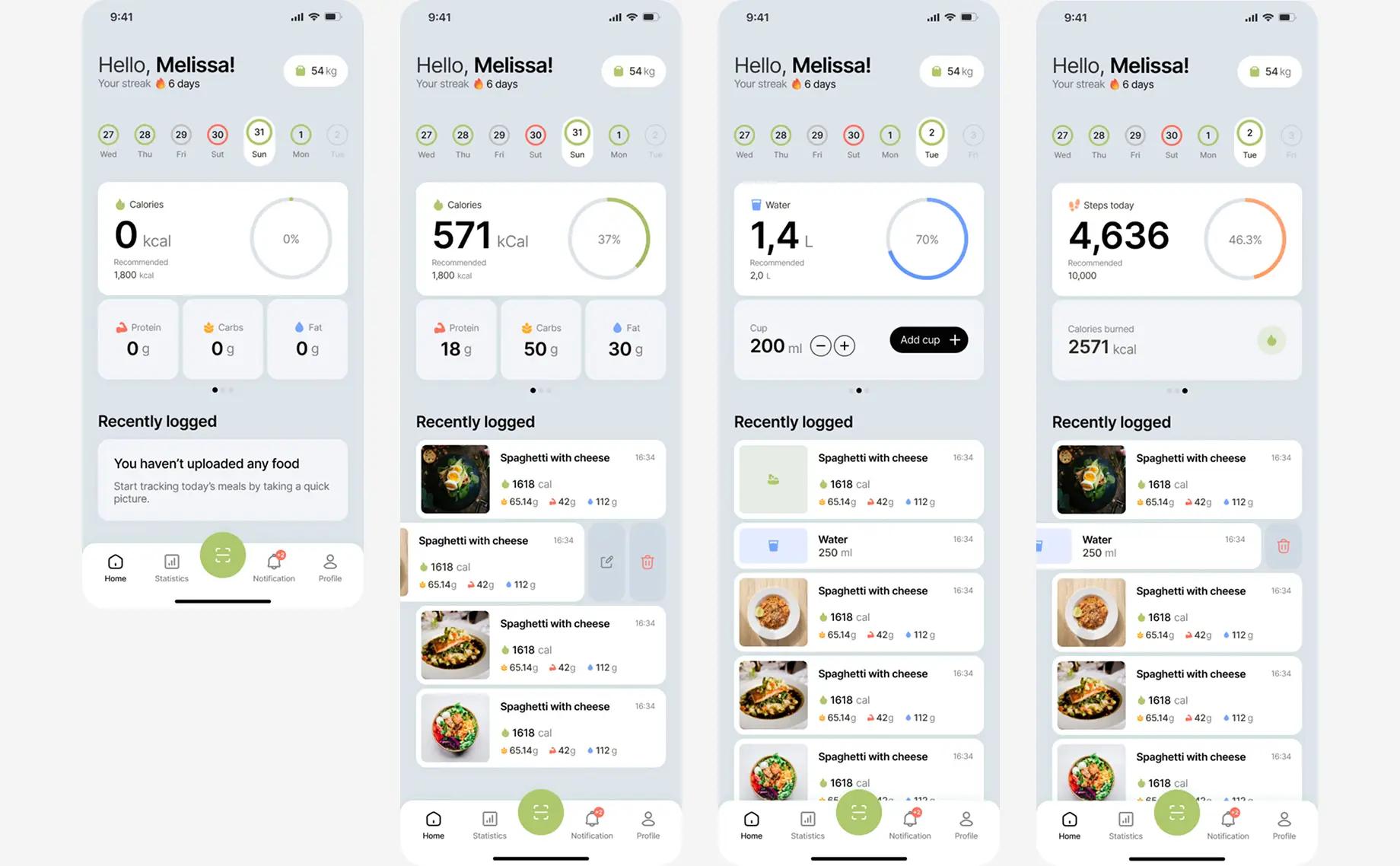
And a 6-day streak right next to the greeting is a small but effective hook: nobody wants to be the one who breaks it.
Food scanning
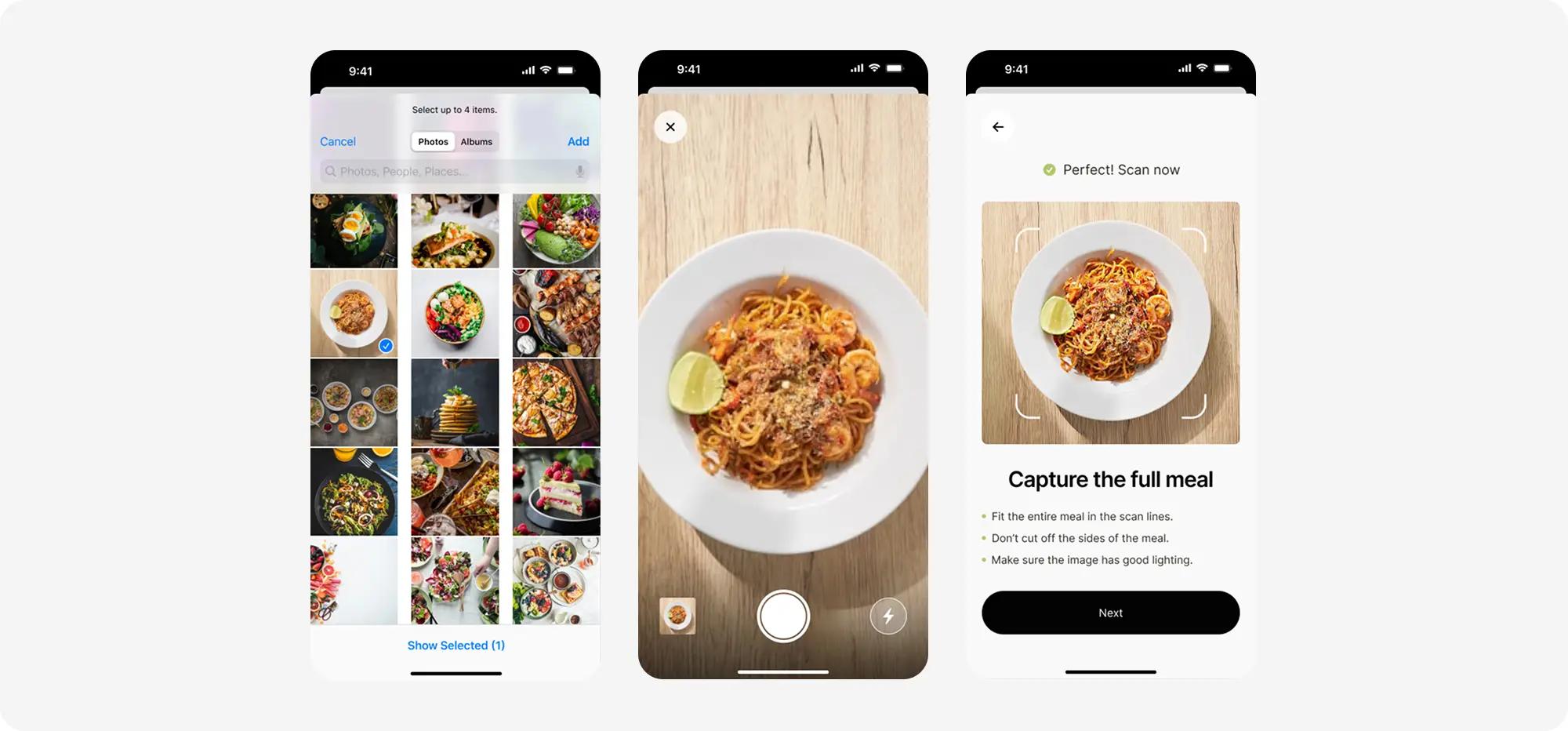
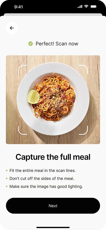
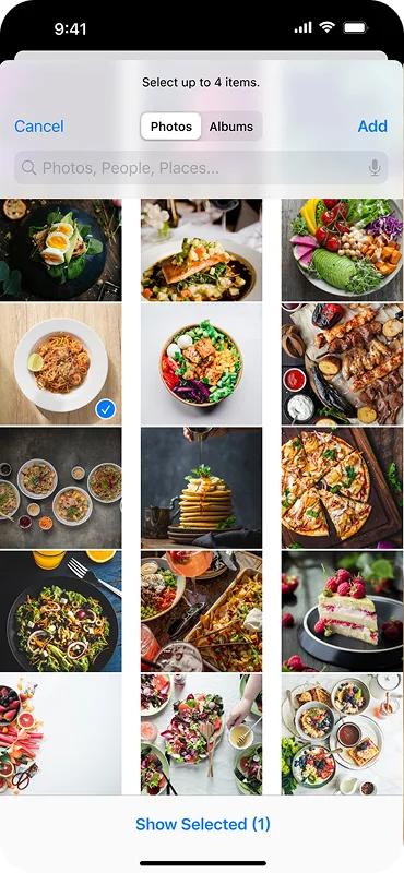
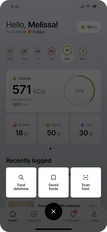
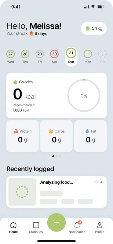
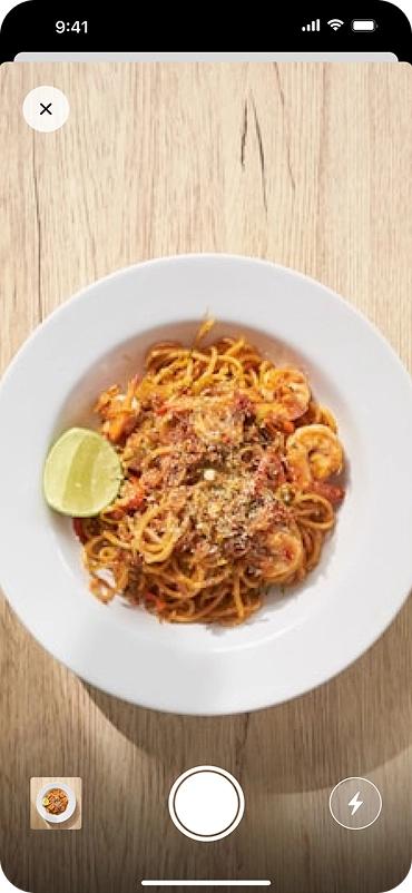
This is the real heart of the app. Instead of scrolling through a food list and guessing portion sizes, the person just points the camera at their plate - one shot replaces 5–7 steps of manually searching for a dish, and that manual search is exactly what makes people abandon classic calorie counters. No surprise the shutter button is the biggest element on screen: the main action should be obvious without any explanation.
Food database & saved foods
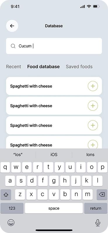
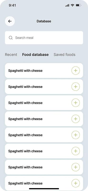
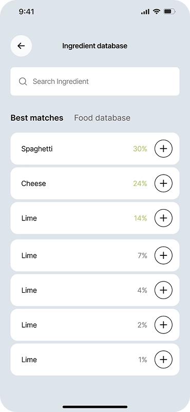
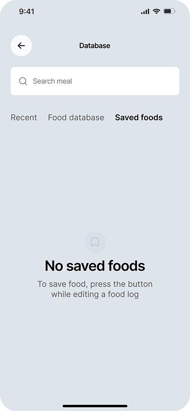
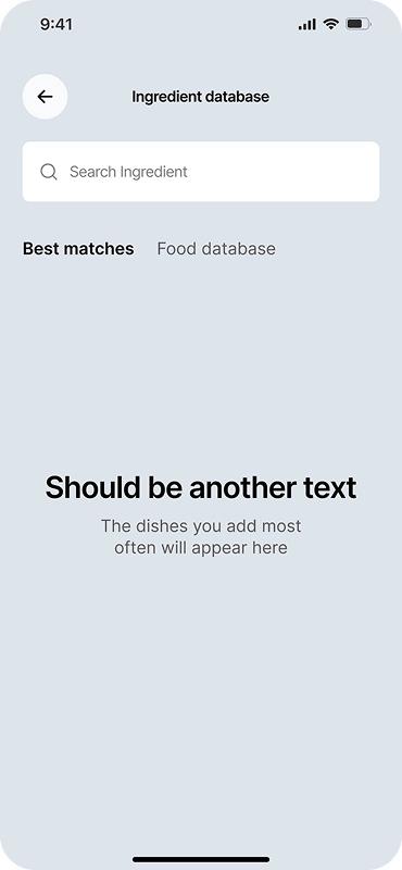
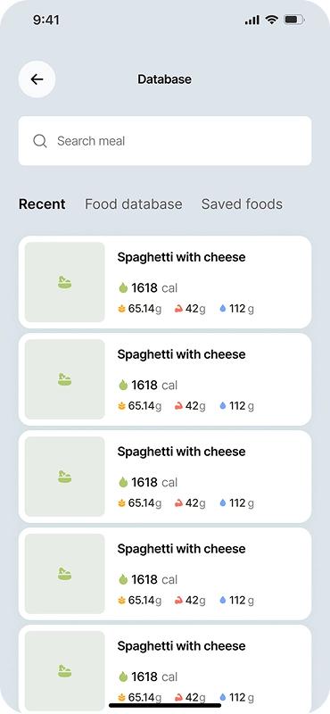
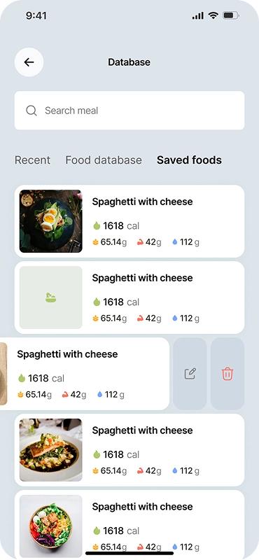
Food recognition isn't always perfect - and the app owns that, letting people easily adjust calories or macros by hand. Editing opens right on top of the food photo, without switching to a new screen, so the person never loses track of what they're actually editing. Saved foods sit one tab over, giving quick access to favorite or frequently eaten dishes without scanning them all over again.
Statistics
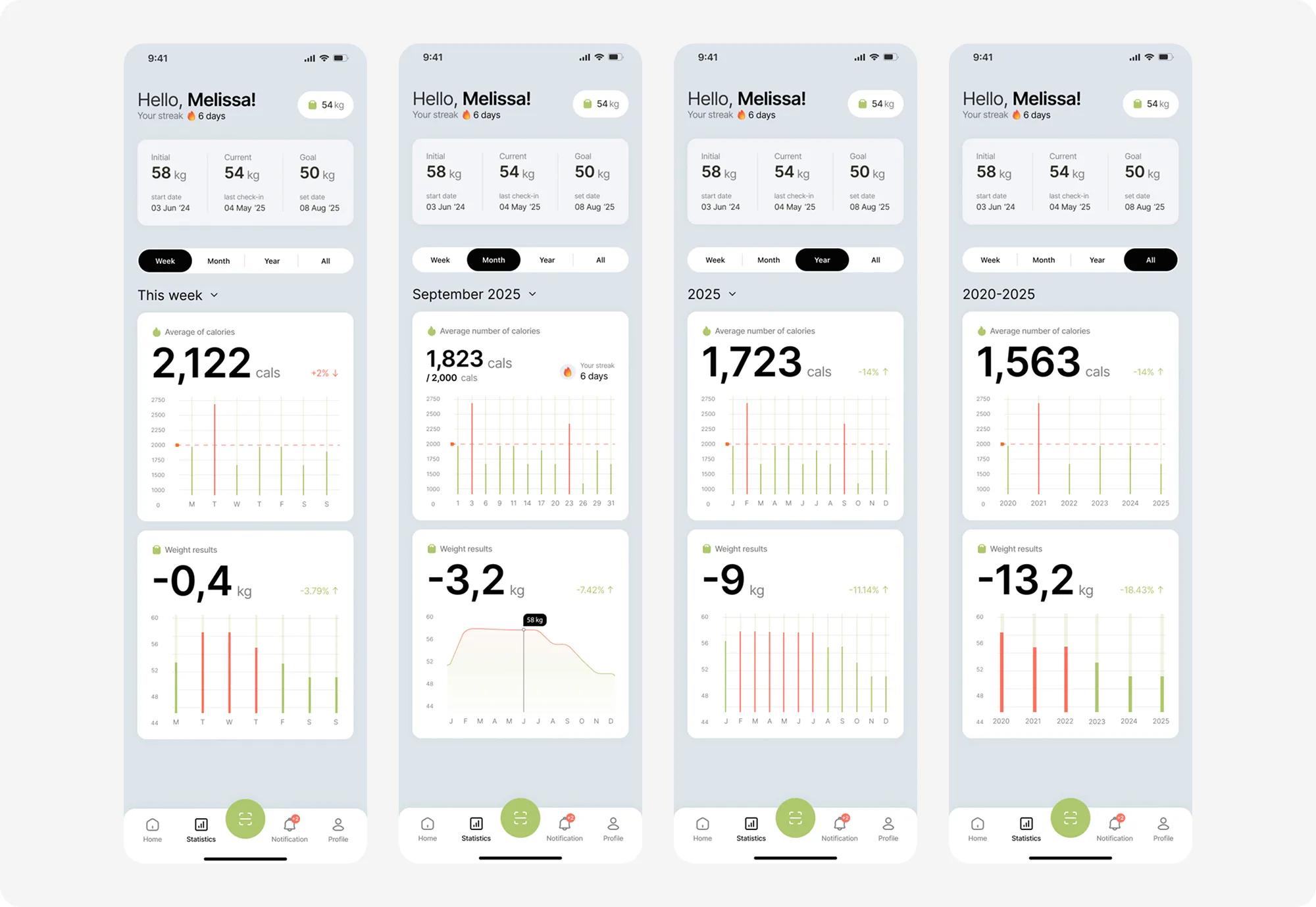
Calorie and weight trends over a week, a month, a year, or the whole time using the app.
Weight check-in
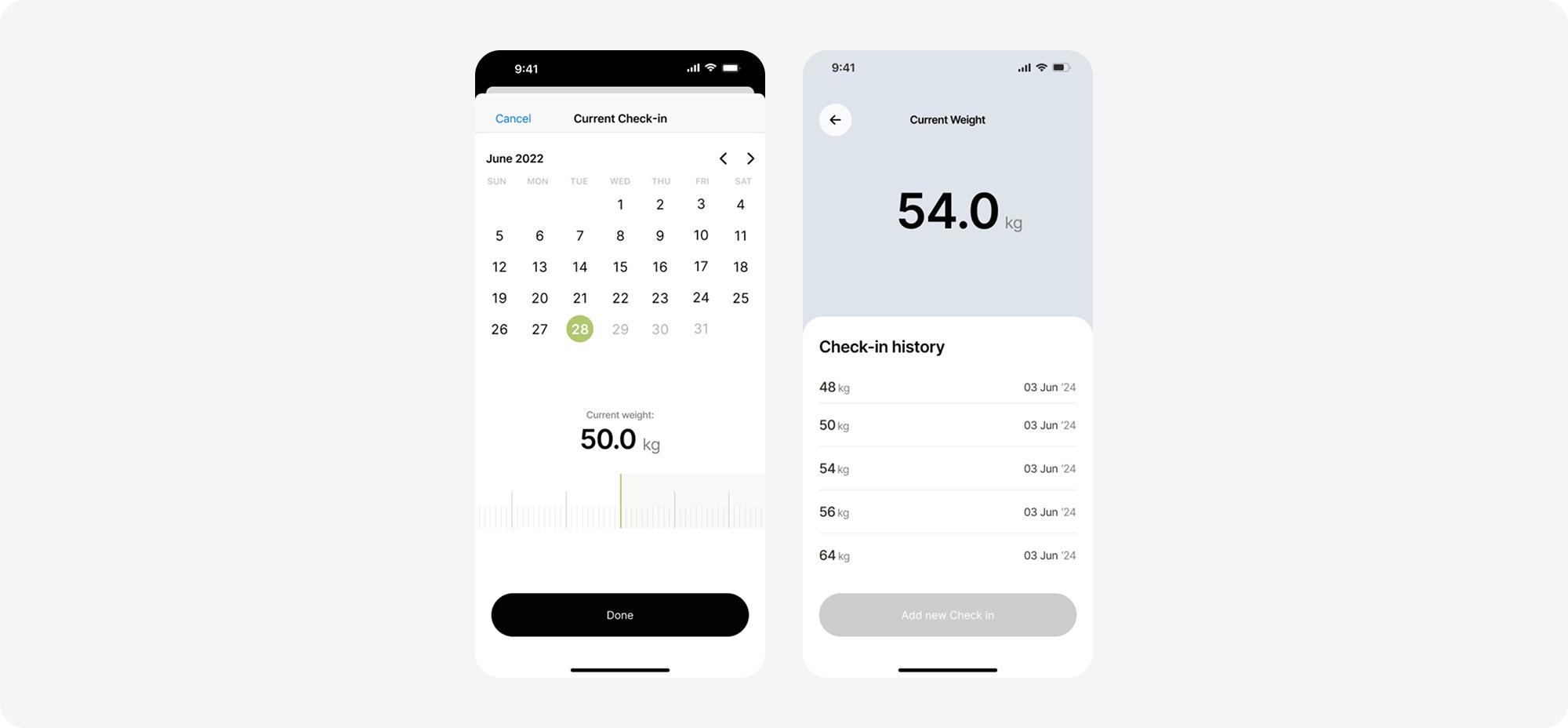
The weight check-in is deliberately calm - big numbers, a soft calendar, no judgment, even if the number moved the wrong way. Previous check-ins are shown right under the current weight, turning a single number into a trend, and a trend is just easier to read than one isolated figure.
Profile & settings
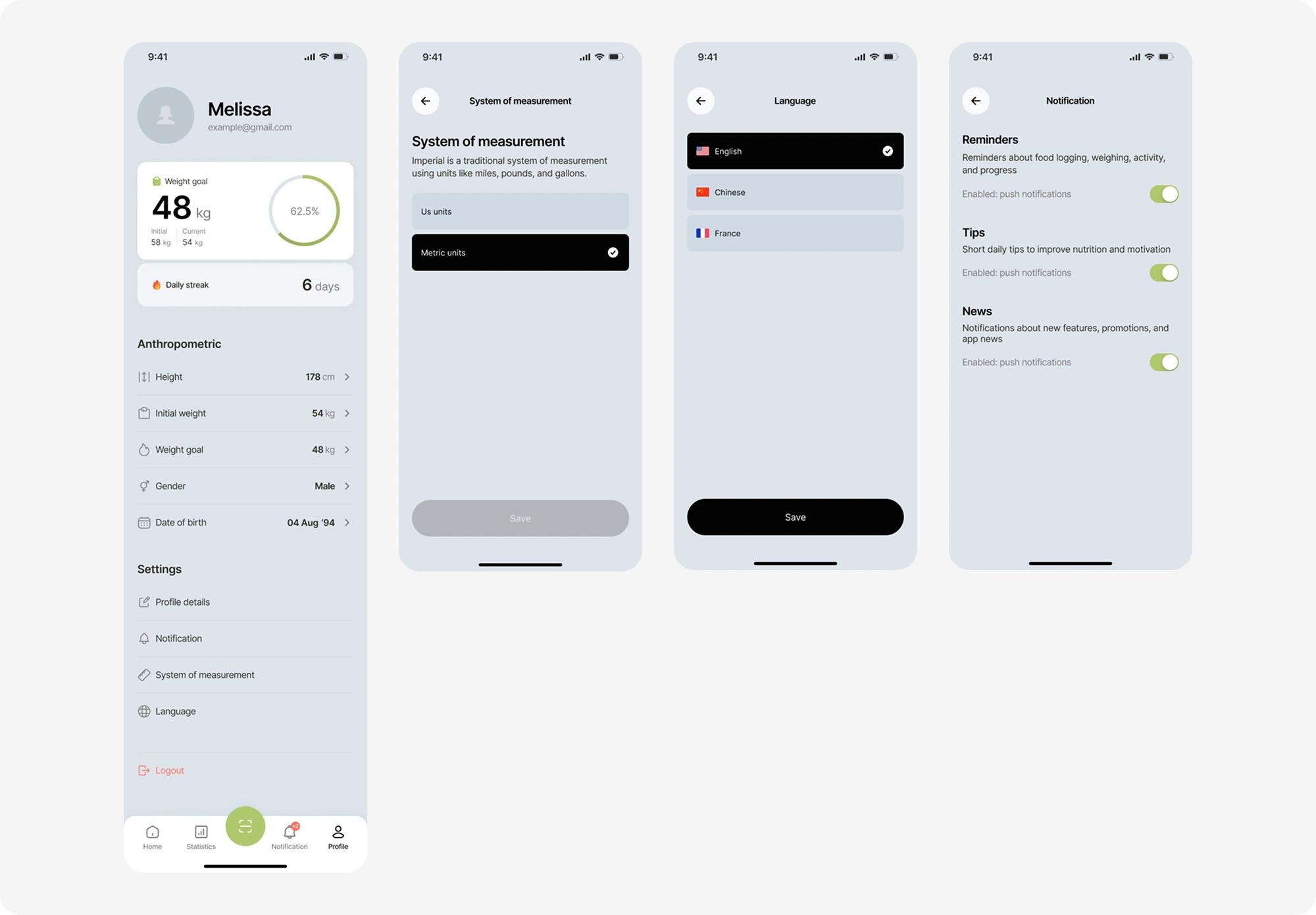
Personal details, body measurements, and account management live in one place. Language, unit system, and notification preferences sit right alongside - everything that shapes the day-to-day experience, without digging through separate menus.
Notifications & support
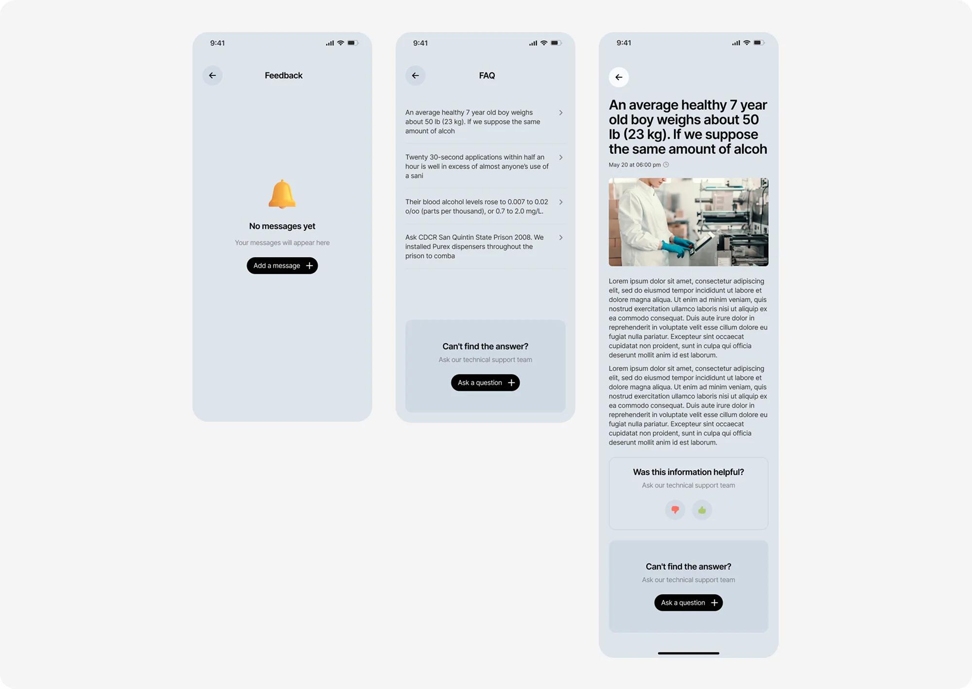
Reminders here aren't spam about discounts, they're gentle nudges: log a meal, weigh in, check progress. Three separate toggles (reminders / tips / news) let people keep what's useful and turn off the rest. And the support section nearby is a reminder that real people are behind the app you can ask the team a question instead of just reading a static FAQ.
Summary
Caloryze is an iOS calorie-tracking app that replaces manual food logging with a single photo. Solpix designed the complete product experience from an adaptive onboarding quiz that builds a personalized nutrition plan, to a photo-scanning core loop, to the dashboard, progress tracking, and retention layer that keep people coming back. The result is 104 screens across 22 functional modules, built on one consistent, minimal visual system.
Customer review
Before C-Counter, tracking meals felt like a chore I'd give up on by week two. Solpix understood that from day one - the whole experience is built around removing friction, not adding features. The photo-scanning flow alone changed how our users interact with the app daily, and the onboarding quiz consistently gets mentioned in App Store reviews as 'the first one that actually gets me.' Working with their team felt less like a design handoff and more like having a product partner.