Evergreen Learning web platform
Evergreen is an educational platform built to make learning exciting and convenient - an intuitive, interactive space where students master core subjects like math, reading, and writing at their own pace. Solpix designed the full product experience: profile, tracker, learning plan, schedule, and testing.


4months
Design time
120
Courses available
9
Languages supported
76%
Learners who return weekly
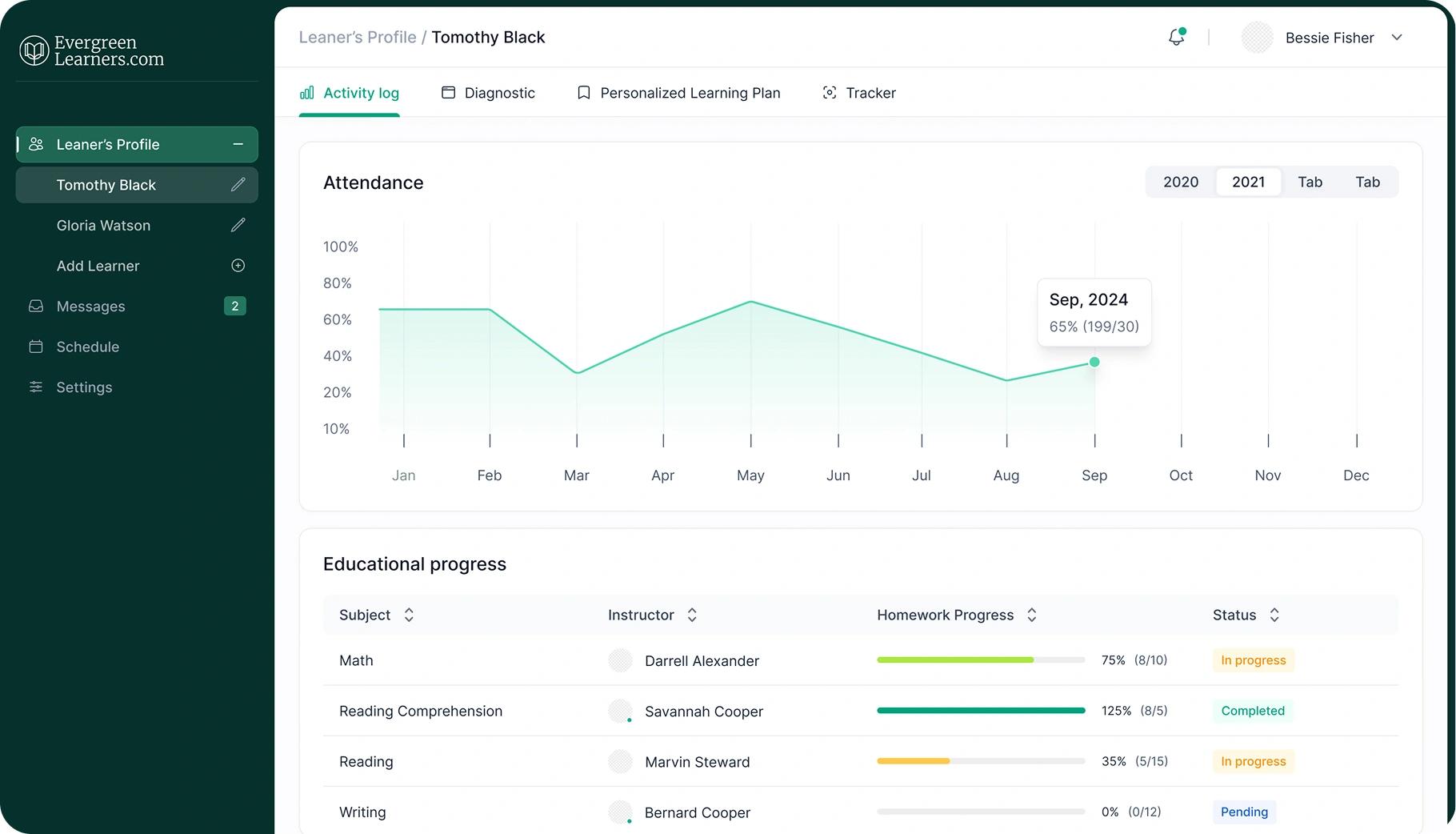
- Make a student's progress legible at every stage
- Bring plan, schedule and messages into one connected space
- Support a long, multi-step onboarding without it feeling like a checklist
- Stay visually consistent across Profile, Plan, Schedule and Tests

A student's journey on Evergreen spans a diagnostic assessment, a personalized study plan, an ongoing schedule, subject tests, and messages all feeding into one another. The challenge was designing this as one coherent system, not a set of separate tools.
Sign Up - Setting the Tone
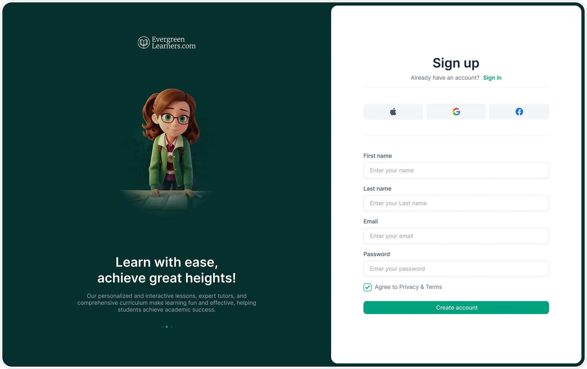
The screen splits in two: on the left, a full-bleed dark green panel with an illustrated mascot and a rotating carousel of value props ("Learn with ease, achieve great heights!") on the right, a clean white form. Social sign-in (Apple, Google, Facebook) sits above the manual fields, so returning-account speed isn't buried under four text inputs. The form itself stays to essentials first name, last name, email, password, one terms checkbox - leaving the heavier personalization (interests, learning objectives, technology footprint) for the Edit Profile step once a student is already inside the product.
Inside the Product
Three sections carry the bulk of daily use: the personalized learning plan, the schedule, and subject testing. Each is designed around what a student actually needs to do in the moment - check today's plan, book a session, take a test - rather than around how the data is modeled underneath.
Personalized Learning Plan
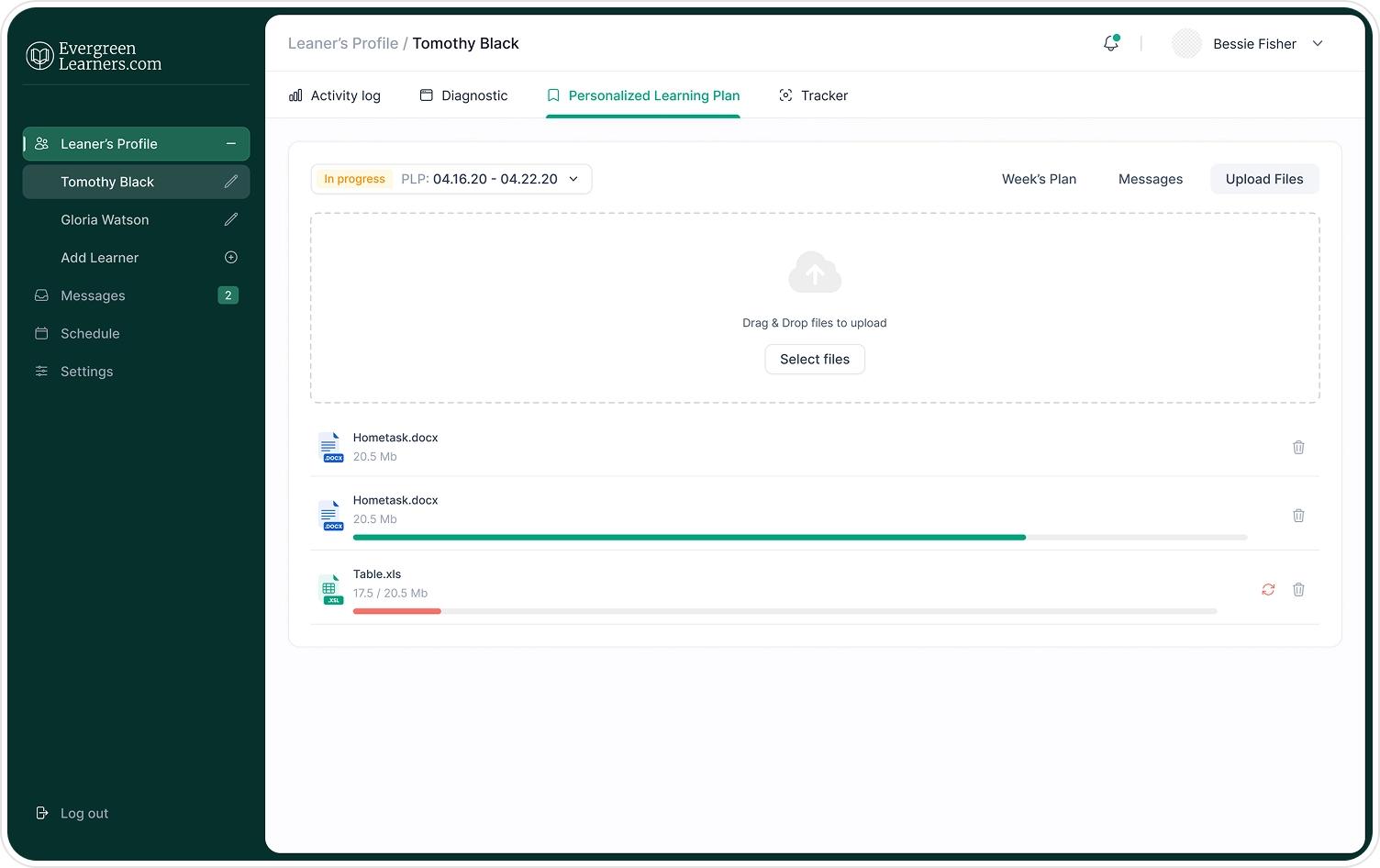
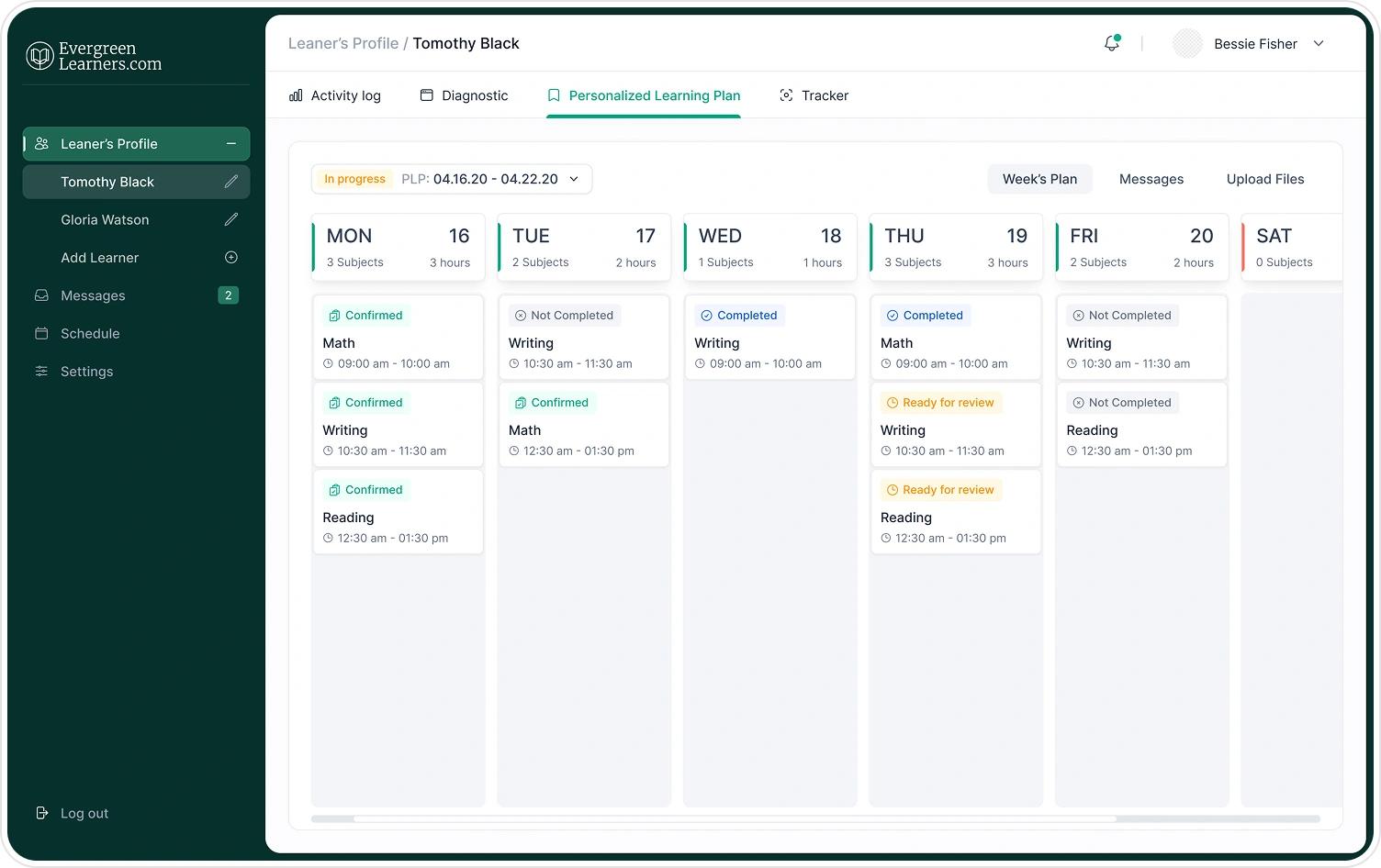
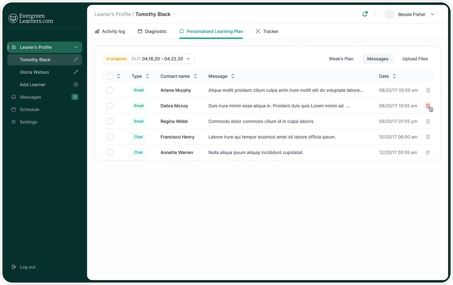
This section brings together a student's weekly plan, downloaded study materials, and related messages the things a student checks most often inside one tabbed view instead of three separate destinations.
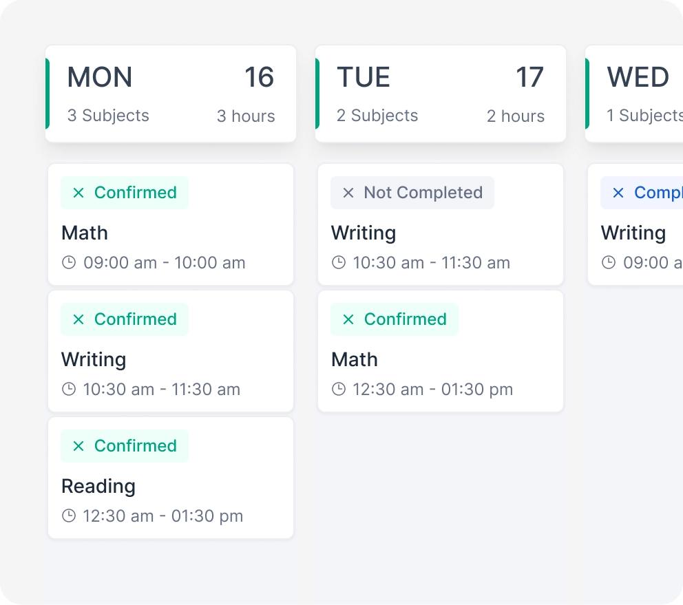
- Week's Plan - this week's assignments and lessons, always in view
- Upload Files - study materials kept in one library
- Messages - updates from teachers, without leaving the plan
- One tabbed view instead of three separate destinations
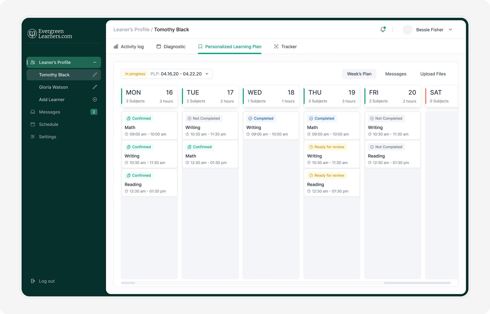
Personalized Learning Plan page for each customer
- FCL (Full Container Load) delivery for large-scale shipments
- Best price-to-volume ratio on the market
- Global port coverage and reliable transit schedules
- No shared container space - full cargo security
Schedule
The Schedule combines a month view with a detailed event-creation flow: event type, title, description, start and end date/time, recurrence, and specific days of the week built to handle both one-off sessions and recurring classes without extra steps.
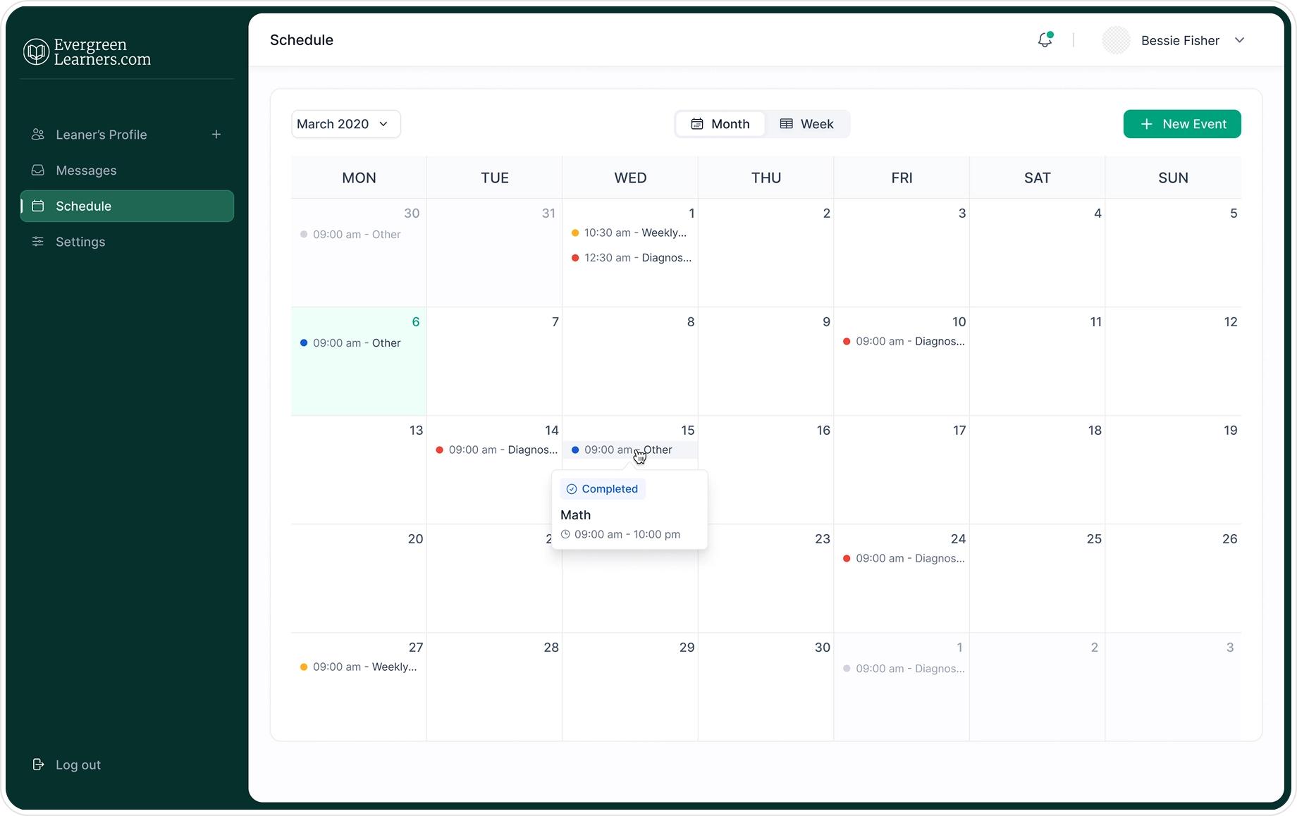
The Schedule combines a month view with color-coded event dots orange for Weekly Conference, red for Diagnostic Session, blue for Other so a student can scan an entire week without opening a single event. Clicking a day reveals a compact popover showing the event's subject, time range, and status (e.g. "Completed"), keeping the full calendar visible underneath instead of interrupting the view with a modal.
- Weekly Conference, Diagnostic Session, or Other - every event has a clear type
- Recurrence and a day-of-week picker for regular classes
- One flow for both single sessions and recurring ones
- A confirmation screen closes the loop once an event is created
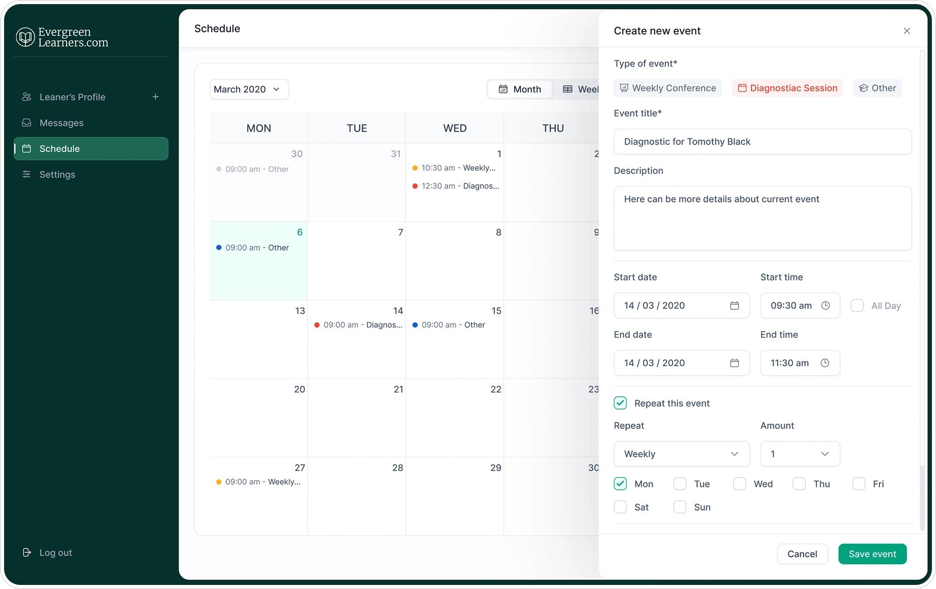
The month view uses color-coded dots to distinguish event types at a glance - orange for Weekly Conference, red for Diagnostic Session, blue for Other - so a student can scan a week without opening anything. Clicking a day opens "Create new event" as a right-side panel rather than a modal, keeping the calendar visible underneath.
The form itself walks in order: event type (three clear options, not a dropdown), title and description, start/end date and time, then an optional recurrence block - weekly/etc., a count, and specific day-of-week checkboxes so a one-off diagnostic session and a recurring weekly class use the exact same flow, just with one section expanded or collapsed.
Tests
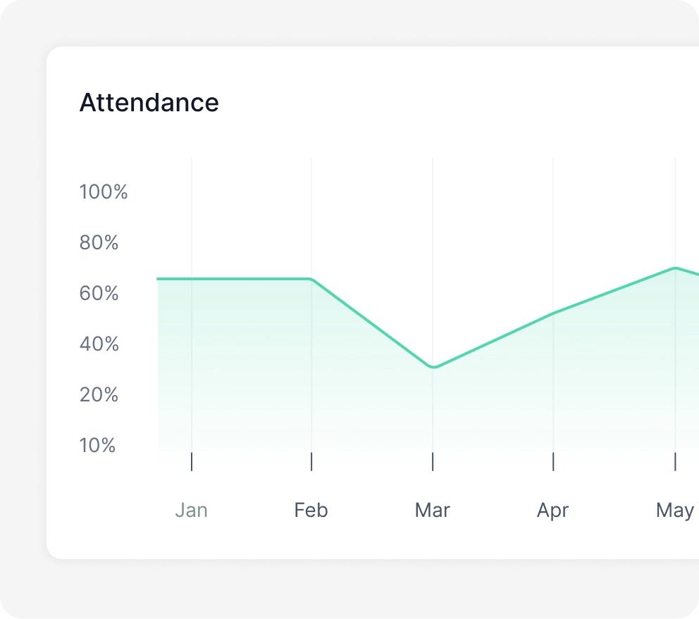
Assessments are grouped by subject - Math, Reading, and Writing so a student always knows which skill area they're being tested on, with results feeding directly back into their Tracker and Learning Plan.
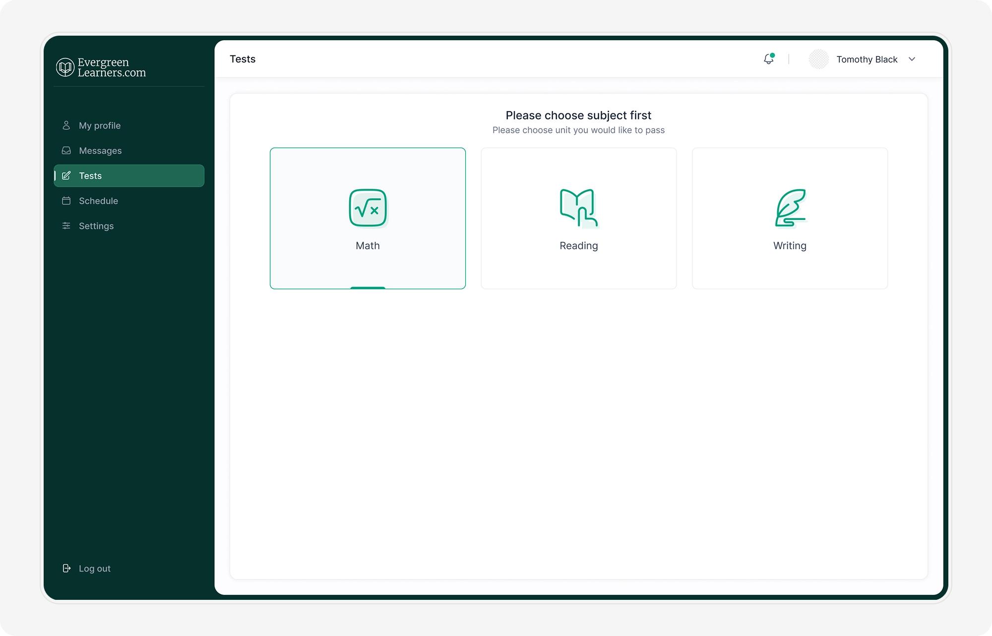
- Math, Reading, and Writing as clear subject categories
- Results feed straight back into the Tracker
- Consistent card layout across every subject
- Built to extend to more subjects later
Edit Profile - Personalization
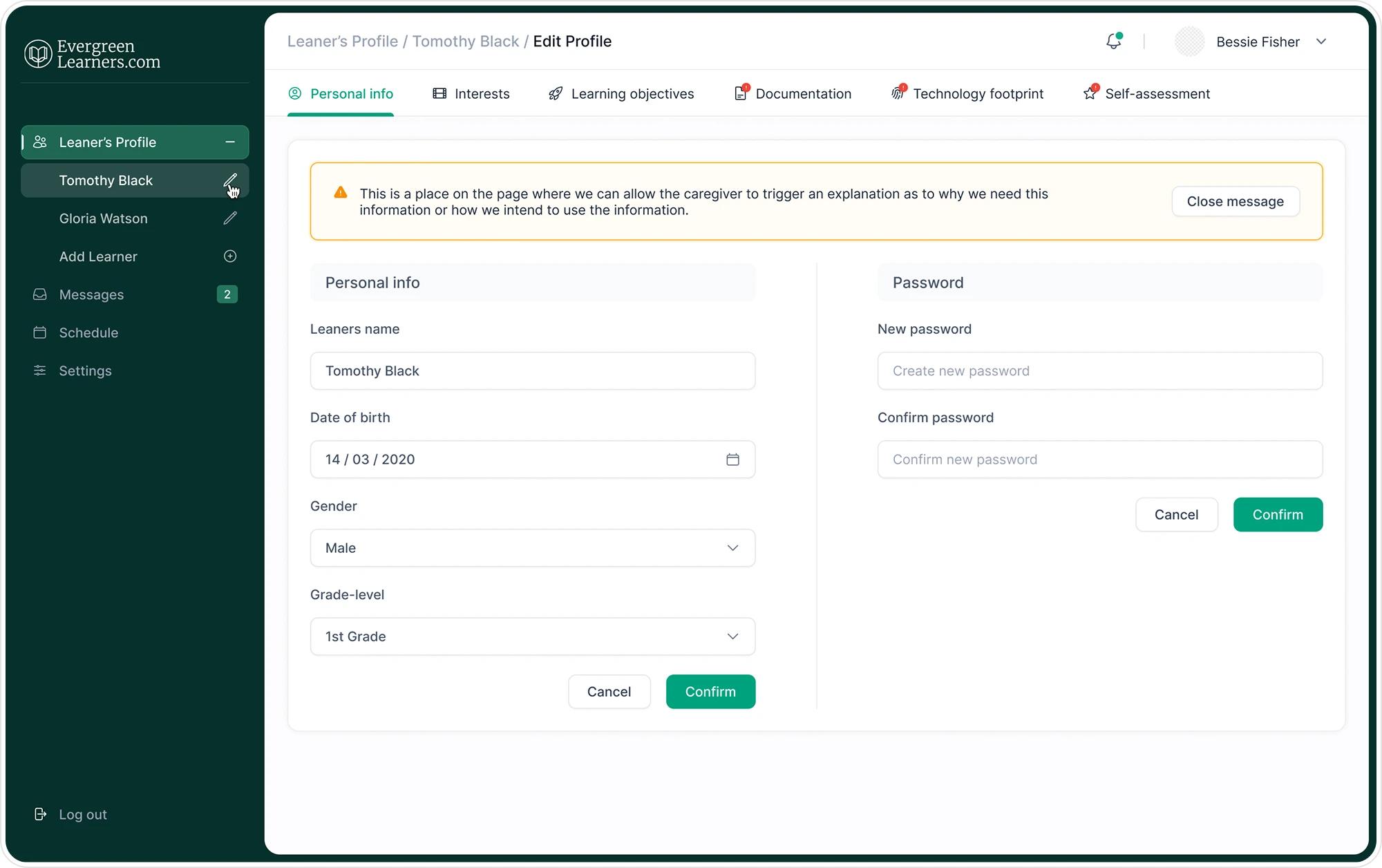
Personalization is split into five focused cards - Personal info, Interests, Learning objectives, Documentation, and Technology footprint so updating one part of a profile never means scrolling through unrelated fields.
- Personal info - name, contact, and core details
- Interests & Learning objectives - what a student wants to focus on
- Documentation - supporting files kept together
- Technology footprint - the tools and devices a student uses
- Five focused cards, one consistent layout
Details worth noting
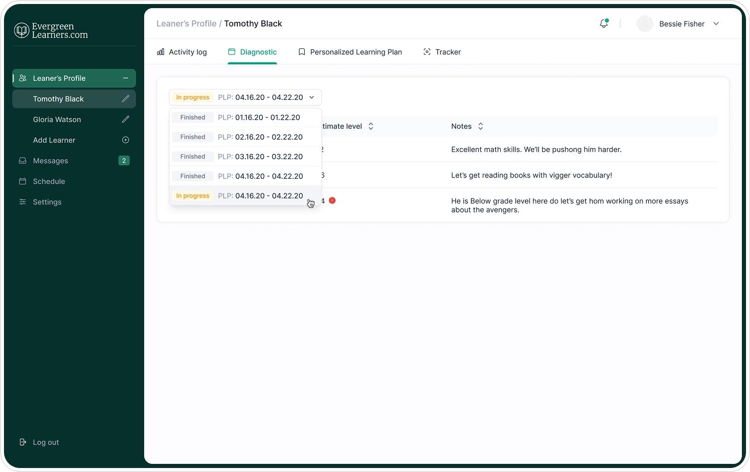
A few smaller states carry as much weight as the main screens: an alert when a student's registration is incomplete, with a direct link to finish it; an info prompt nudging a student to add missing skills information; and a confirmation state once an event is successfully created. These moments were designed with the same care as the primary flows, since they're often where users get stuck.
Result
The result is a connected learning experience where progress, plan, schedule, and testing reinforce one another held together by a consistent step-tracker pattern and a shared visual language across every screen.
Customer review
What impressed me most was how a genuinely long, multi-step process - registration, diagnostics, and a full learning plan never felt overwhelming. Every screen just made sense