Healthcare Map Case Study: UX Design for Complex Data Visualization
Healthcare Map is an analytics web platform that visualizes key mortality indicators around the world in real time: accidents, disease outbreaks, and the opioid crisis. The product is built for government organizations, researchers, and companies that need to quickly assess risk in a specific region and make decisions based on up-to-date data.



5months
Time to design
2.1M+
Data points visualized
190
Countries mapped
Weekly
Data refresh rate
The main challenge was fitting a huge volume of statistics (global, national, and local levels; dozens of diseases; demographic breakdowns; real-time news) into an interface that's comfortable to use without special training. The solution: a multi-level interactive map with filters that reveals detail progressively - from world, to country, to city. opioid crisis
Real-Time News and Threat Updates
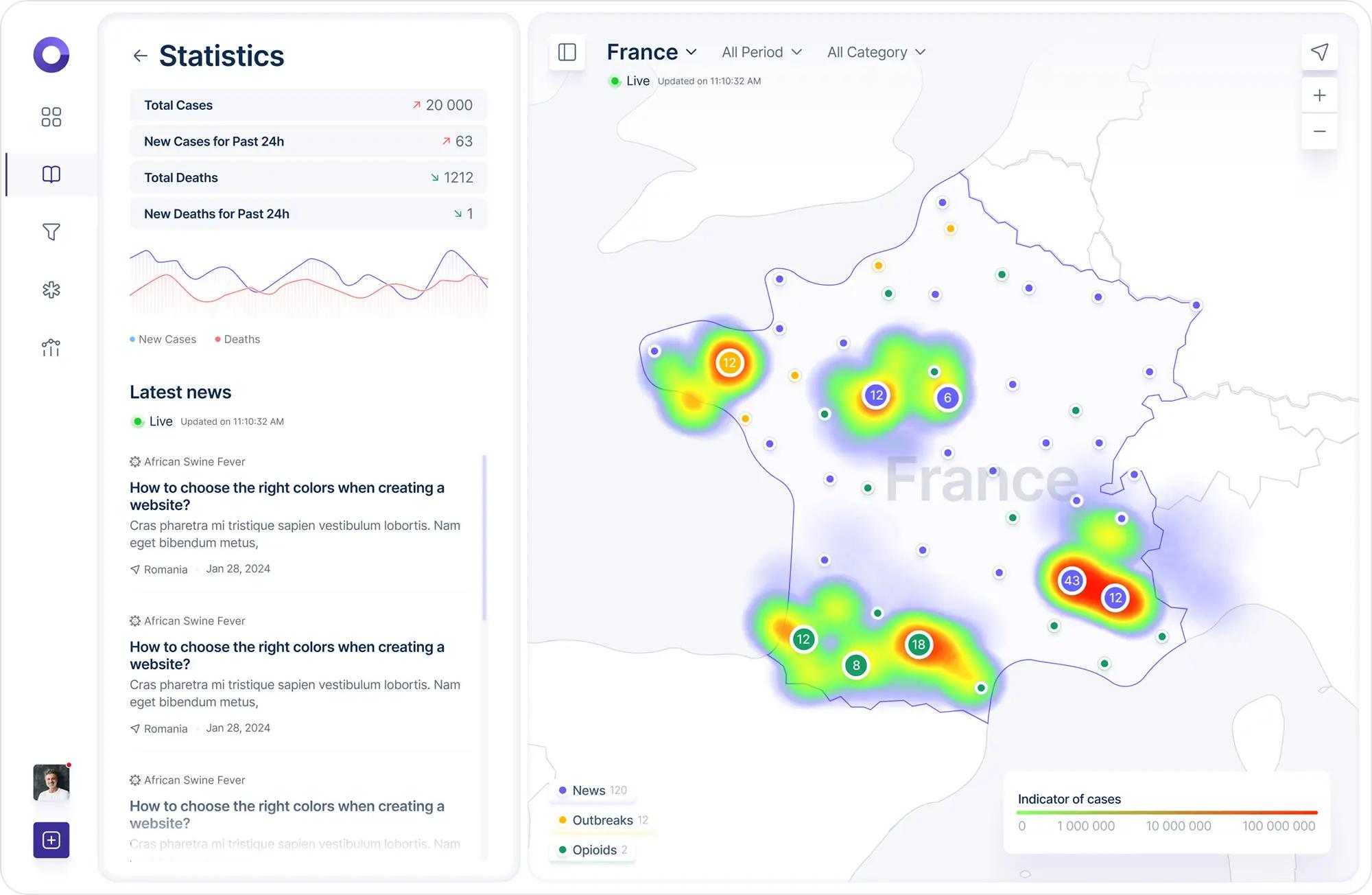
A dedicated "Outbreaks & News" block keeps users up to date on current events: disease outbreaks, new research, country-specific statistics - with a live update timestamp ("Live Updated on 11:10:32 AM"). The news feed is built directly into the statistics panel, so users see context and figures within the same field of view.
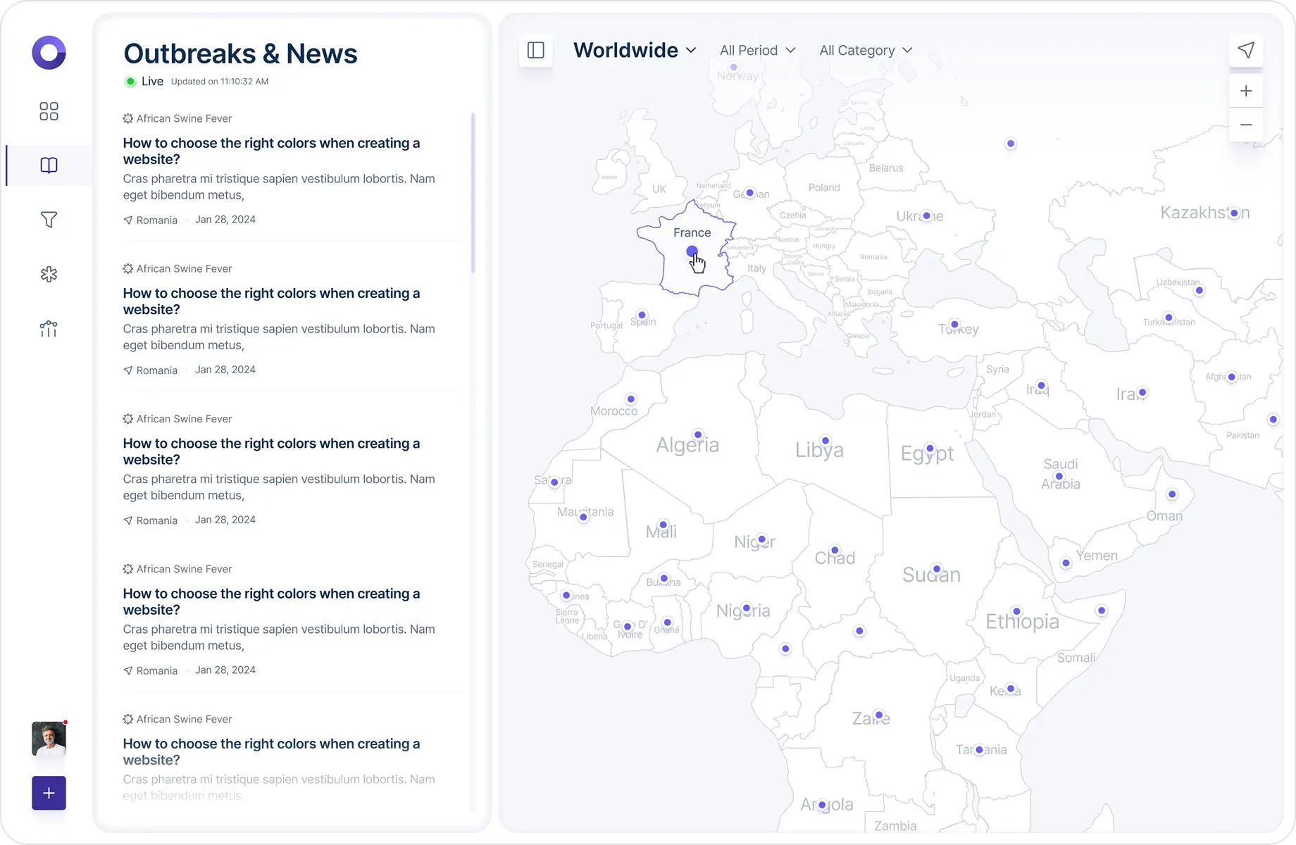
Home screen: an interactive world map with key threat indicators
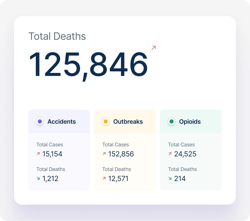
Key Metrics: The "Catastrophic Triangle"
To immediately convey the scale of the problem, the intro screen highlights three large, accented figures:
- 6.9 million deaths from COVID-19 and over 770 million infection cases worldwide.
- Over 1 million overdose deaths in the US since the "opioid crisis" began in 1999 - more than the total number of deaths in many wars the US has participated in.
- Over 5 million deaths from accidents - the third leading cause of death after cardiovascular disease and cancer (roughly 9% of all deaths worldwide).

This "big number + short context" format immediately sets the tone for the product: this isn't abstract analytics, it's data that affects real human lives.
News Detail Page
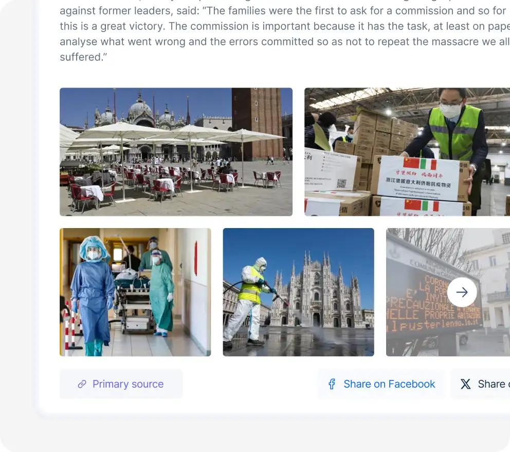
From a news card, users can open the full article - for example, "France announces inquiry into its handling of Covid-19 pandemic" - complete with quotes from involved parties, a link to the primary source, and share buttons for Facebook and X. This turns the dashboard from a source of numbers into a media hub for tracking the topic.
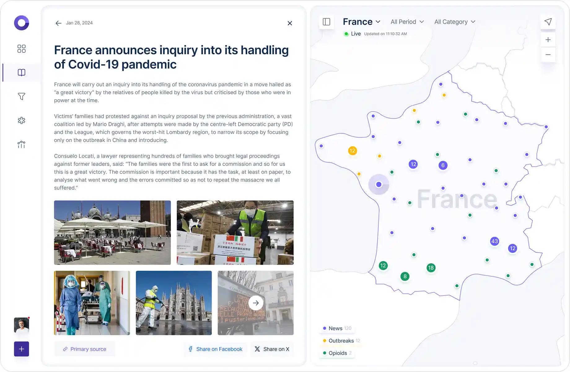
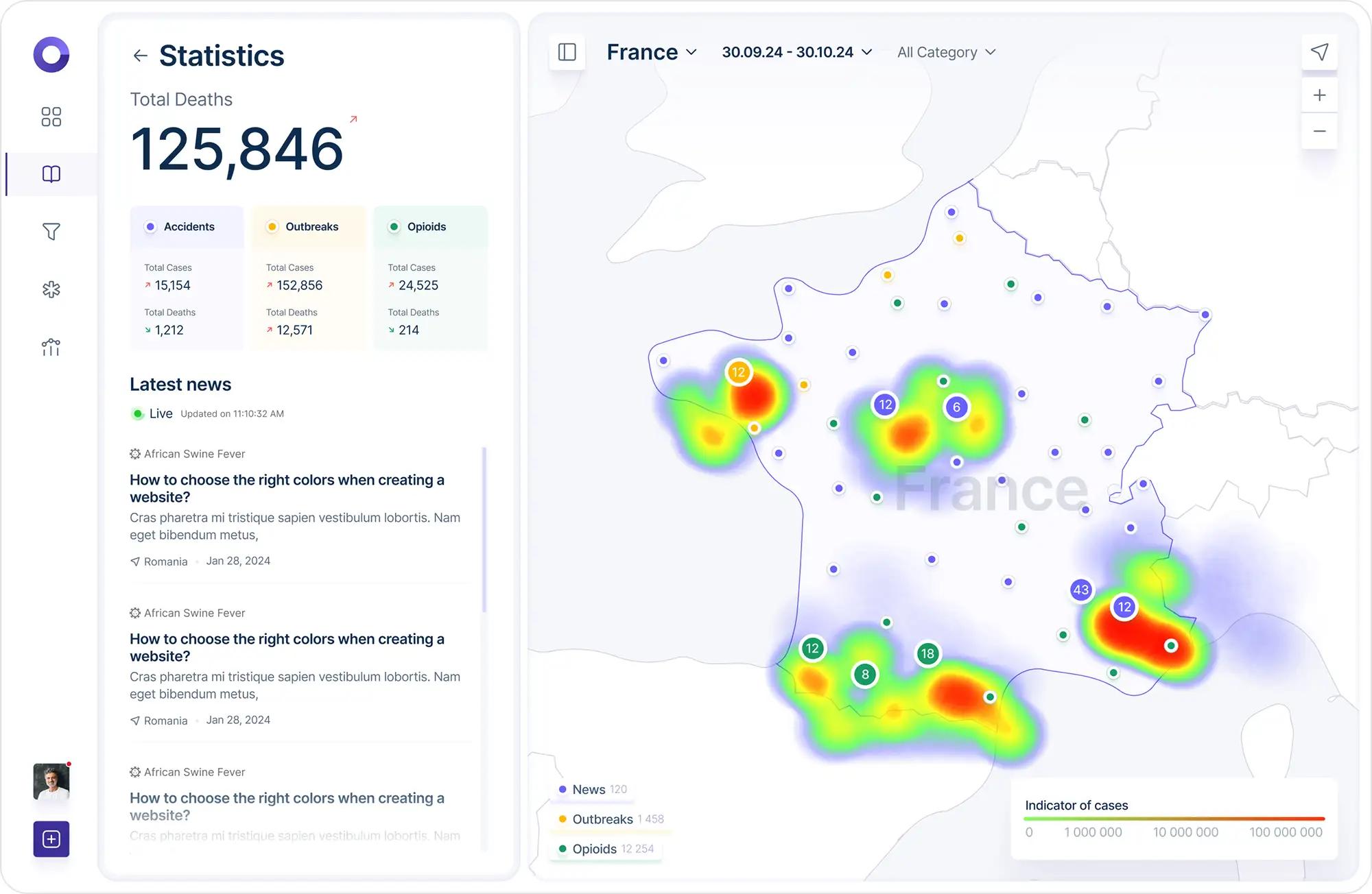
Two-panel layout combining a live, clusterable map of health-related news (News, Outbreaks, Opioids) with a detail panel that opens the full article, images, and primary source for any selected data point letting users explore data spatially while staying grounded in verifiable reporting.
Interactive Filters for Personalized Data Analysis
The filters page lets users customize how mortality data is displayed - from geographic region to event category (pandemics, accidents, overdoses). Flexible tools let users filter by period, country, and incident type, and even compare multiple options at once for detailed statistics
These filters help companies and governments allocate resources more effectively to prevent disasters and crises by studying the most vulnerable regions and risk factors.
Country and Regional Statistics
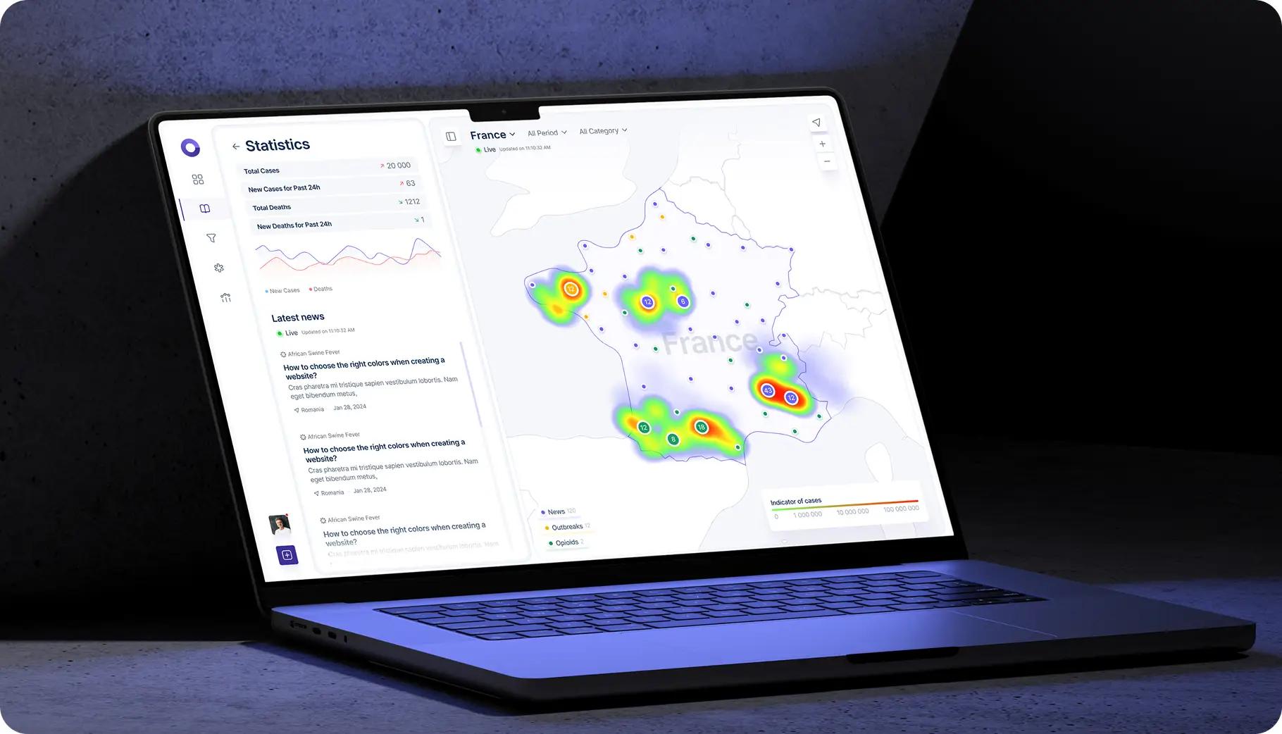
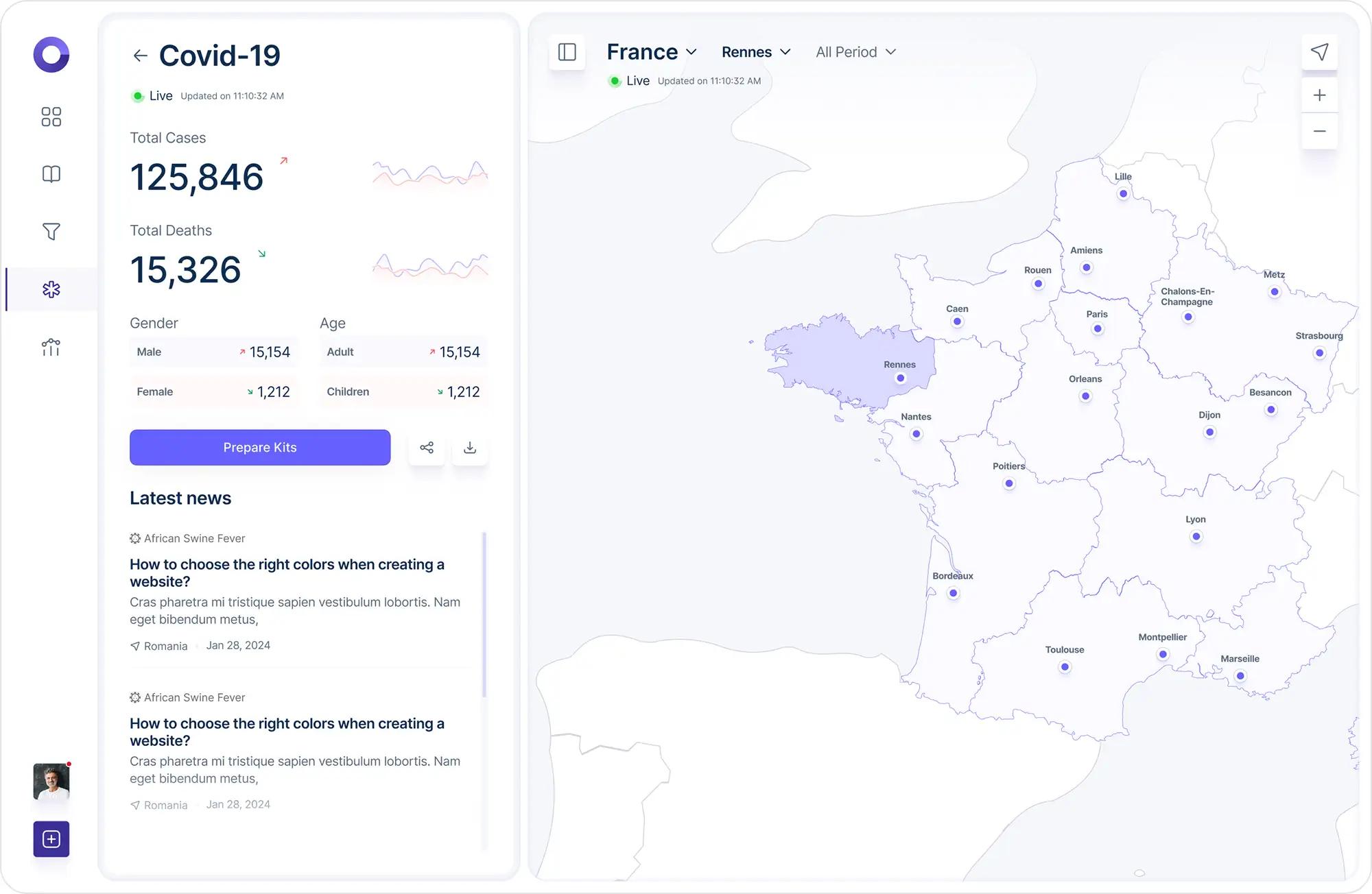
The "World statistics of diseases, accidents or drug overdoses" section provides a complete picture of cases within a specific country: users choose a country, a time period, and a demographic group (gender, age), while a map of cities (e.g., France - Rennes, Lille, Paris, Lyon, Marseille) shows the geographic distribution of cases
Global Disease Analysis
The "Global Health: An Analysis of Mortality from Disease, Accidents or Drug Overdose" section gives an overall picture of how various diseases spread and affect the population - presented as a table of ten diseases (COVID-19, dengue fever, cholera, mpox, avian influenza, antimicrobial resistance, and others), each broken down by number of cases, deaths, gender, age, and regions with the highest surges.
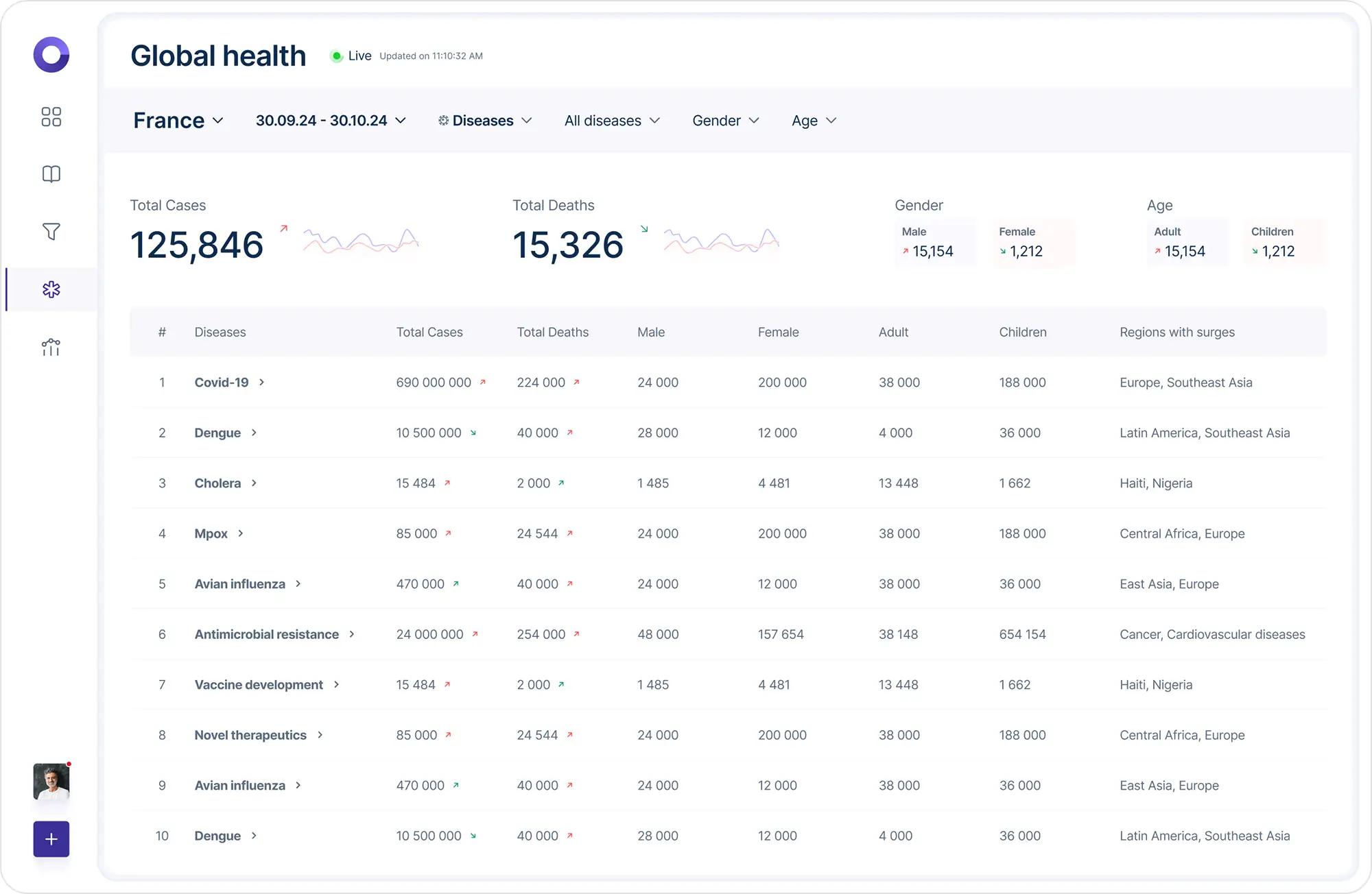
Below the table are short explanatory cards for the most important entries:
- COVID-19: 690 million cases and 224 thousand deaths - a scale that changed the course of global history and accelerated vaccine development.
- Antimicrobial resistance: 24 million cases and 254 thousand deaths - one of the biggest threats to humanity as antibiotics become less effective.
- Dengue: 10.5 million cases and 40 thousand deaths, mostly in Latin America and Southeast Asia, where climate change contributes to the spread of the virus.
Summary
Healthcare Map shows how complex, multi-layered analytics can be presented as a clear, living interface: a map as the main entry point, progressive detail from global to local level, news in the context of the numbers, and clear headline metrics that immediately convey the scale of the problem. This approach can be applied to any dashboard that needs to combine geo-data, real-time statistics, and convenient filtering.
Customer review
Healthcare map has become an indispensable tool for our company. Flexible filters and detailed statistics allowed us to promptly monitor key threats in our regions of activity.