Gold Safe Exchange website design
Designing a trustworthy, high-conversion platform for precious metals IRA investors



3weeks
Launch time
256bit
Encryption standard
<1hour
Average recovery time
4
Security certifications
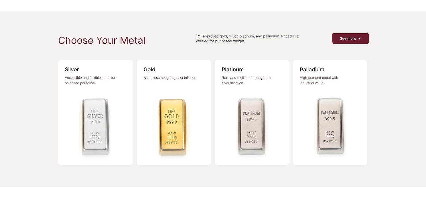
Gold Safe Exchange helps everyday investors move part of their retirement savings into physical gold, silver, platinum, and palladium. Solpix Studio partnered with the team to design a full website experience from first impression to lead capture built around one goal: make a highly regulated, unfamiliar financial product feel simple, transparent, and safe to act on.
The Challenge
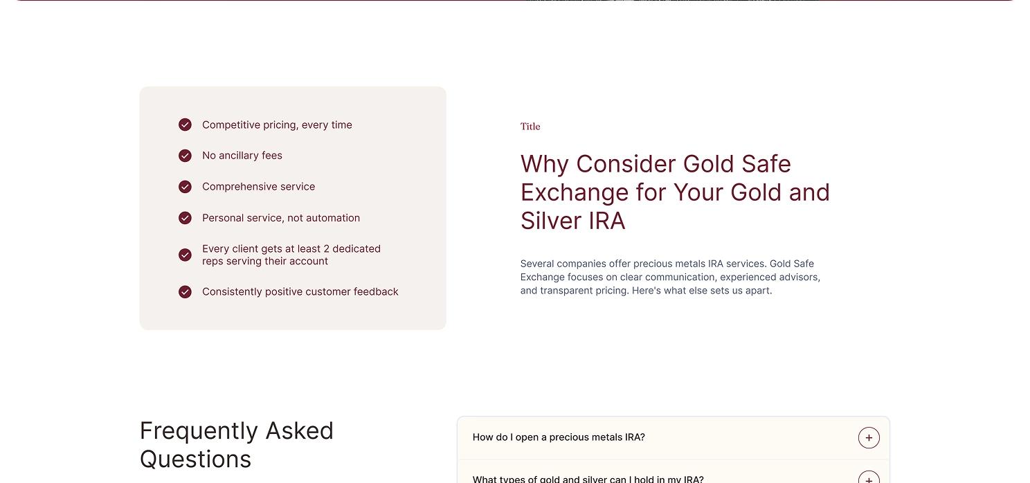
Precious metals IRAs sit at the intersection of finance and skepticism. Buyers are typically 45+, cautious about market volatility, and wary of the aggressive sales tactics common in the industry. The existing brand had no consistent visual language, no live pricing presence, and a homepage that buried its value proposition under generic stock imagery. We needed a design that could earn trust in the first five seconds and guide a hesitant visitor toward a conversation with a real advisor without ever feeling like a hard sell.
Who we're designing for
The profile that guided every decision below:
- Age 45+, nearing or already in retirement, protecting savings they've spent decades building
- Financially literate, but new to self-directed IRAs specifically
- Wary of the aggressive telemarketing common across the bullion industry
- Want to talk to a real person before committing to anything

Research & Strategy
We audited competitor IRA and bullion sites and found two recurring failure patterns: overly corporate "fintech" interfaces that felt cold, or aggressive "sales page" layouts that felt untrustworthy. Neither matched the audience investors who want confidence, not hype.
What we found
Two failure patterns showed up again and again:
- Corporate fintech sites: clean and modern, but cold and impersonal for a life-savings decision
- Aggressive sales pages: urgency-driven, but read as untrustworthy to a cautious buyer
- Gold Safe Exchange needed to sit deliberately in between: warm, human, and precise
Our process
Four phases, start to finish:
- Competitor and positioning audit
- Visual direction and palette exploration
- Component-level UI design and design system build
- Homepage assembly, review, and handoff
Visual Direction: Color
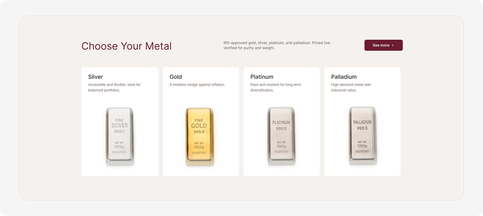
The palette had to do two jobs at once evoke the physical warmth of gold and silver, and signal financial seriousness. Both accent colors sit on a soft cream and off-white base instead of clinical white, giving the whole interface a tactile, welcoming quality closer to a private consultation than a trading terminal.
Primary palette
Three colors do all the work:
- Deep burgundy - primary brand color; premium and serious without the coldness of navy
- Warm gold - accent color that ties directly back to the product itself
- Cream & off-white the base every section sits on
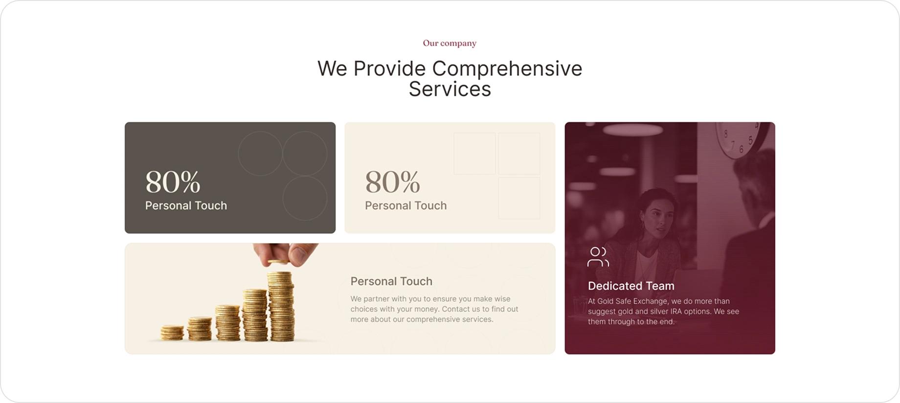
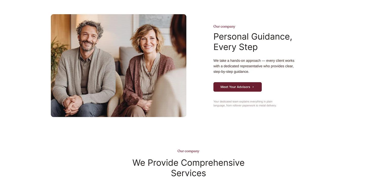
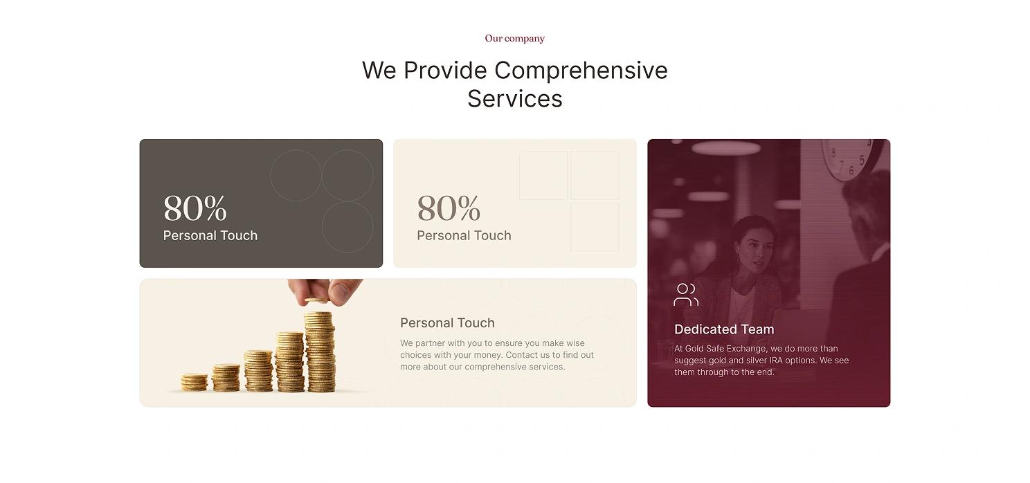
For over a decade, we've helped clients protect their savings through physical gold and silver. Every recommendation is built around your goals, not a sales quota. From your first call to your final decision, our team stays by your side answering questions, explaining options, and making sure you feel confident every step of the way.

Typography & Hierarchy
Inter carries the entire interface. Its neutral, highly legible letterforms stay out of the way of the content critical on a page dense with pricing data, disclosures, and form fields.
Type scale in use
The scale in practice:
- 54 / 44 hero headlines, the first thing a visitor reads
- 24 / 20 section and card headers, organizing the page into scannable blocks
- 19 / 16 supporting copy and body text, sized for comfortable reading by an older audience
UX Decisions
Every UX decision on this page exists to move one emotion: from "I'm not sure about this" to "I'd like to talk to someone."
Five decisions that build trust
Each one chips away at a specific kind of hesitation:
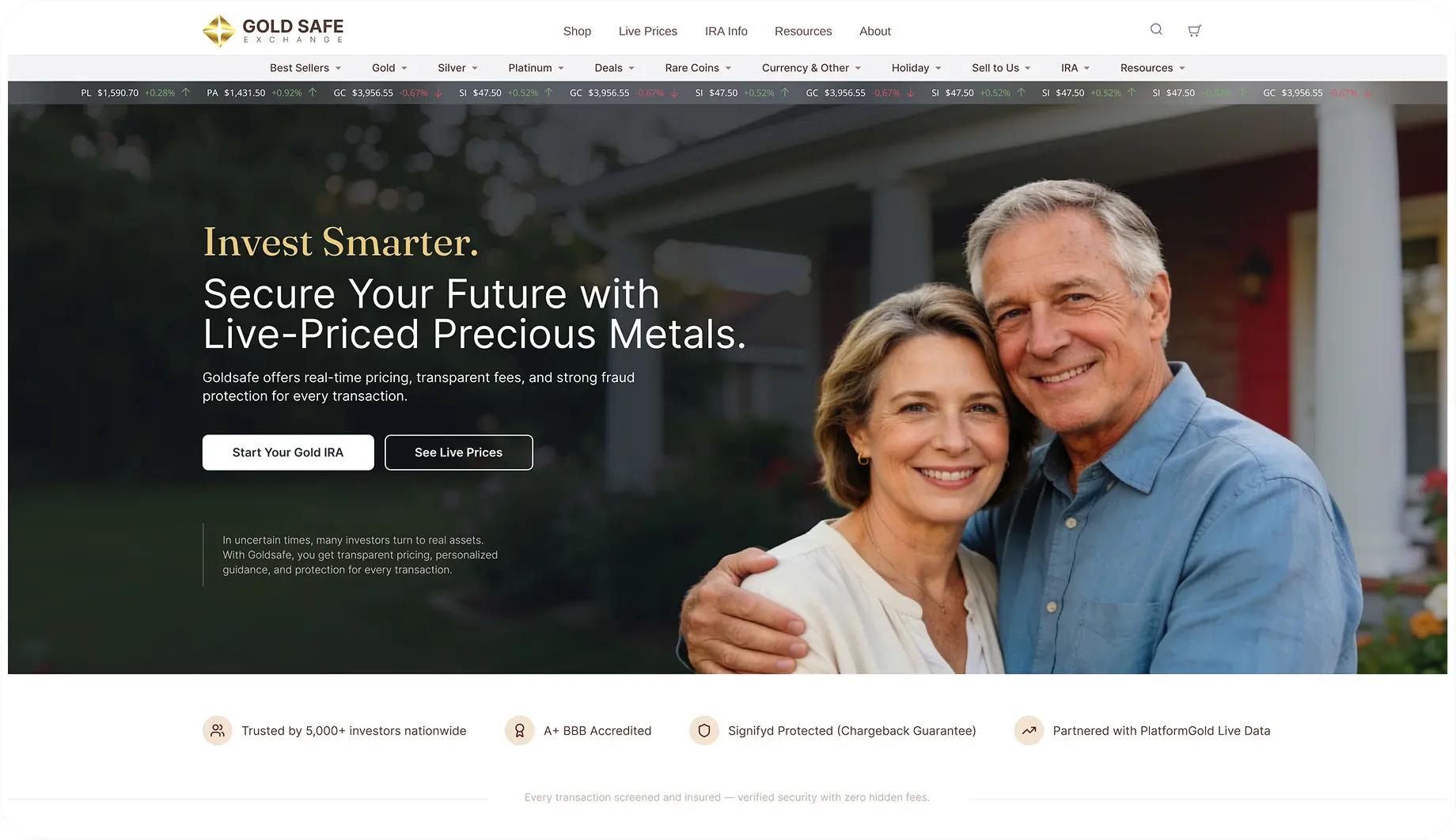
Live pricing, up top
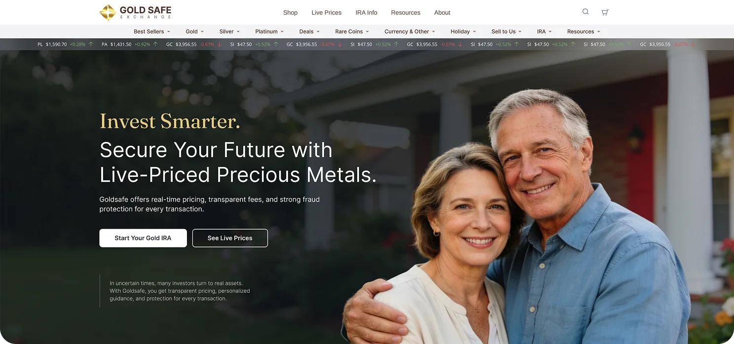
Real numbers, updating in real time, prove transparency before a single word of marketing copy is read the opposite of a sales pitch.
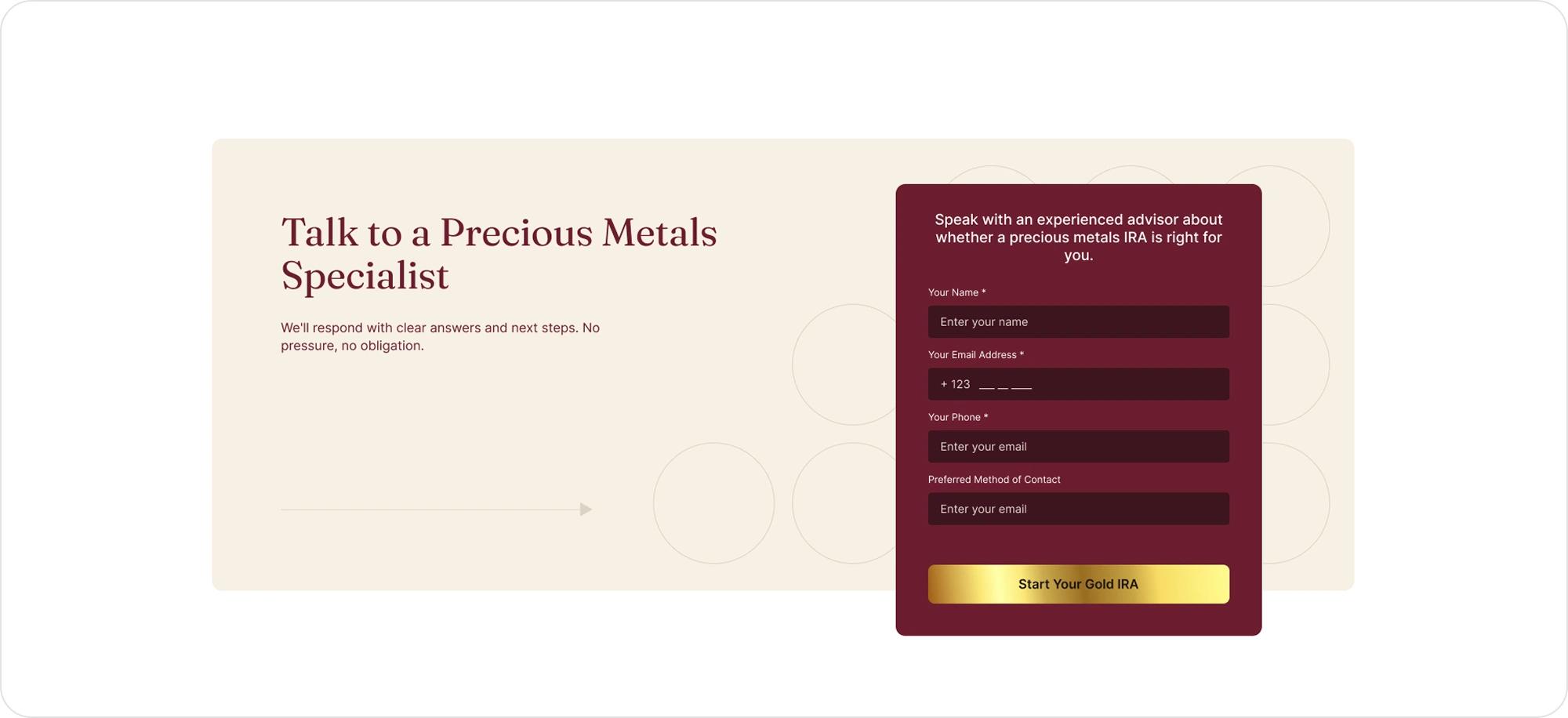
A low-friction lead form
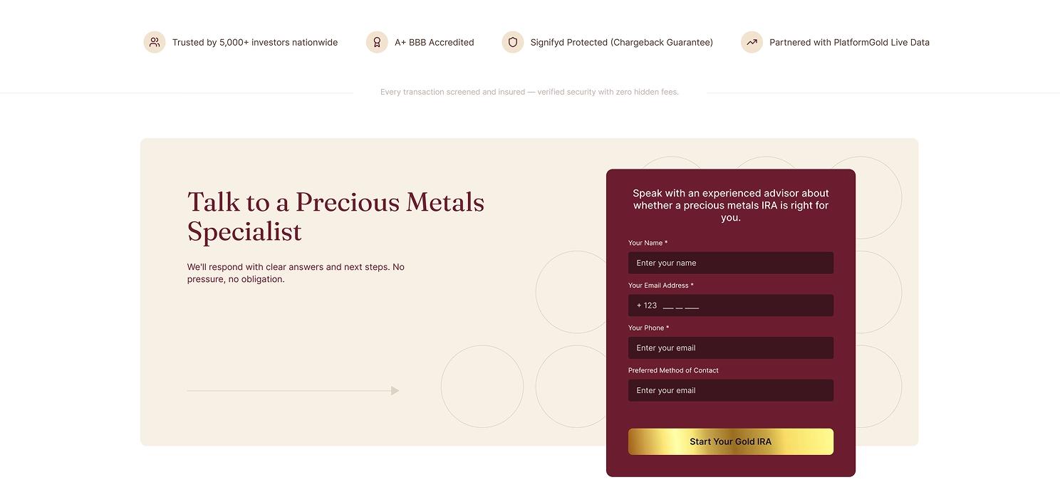
A lead form above the fold, paired with an advisor photo and no-pressure microcopy, lowers the barrier to that first conversation.
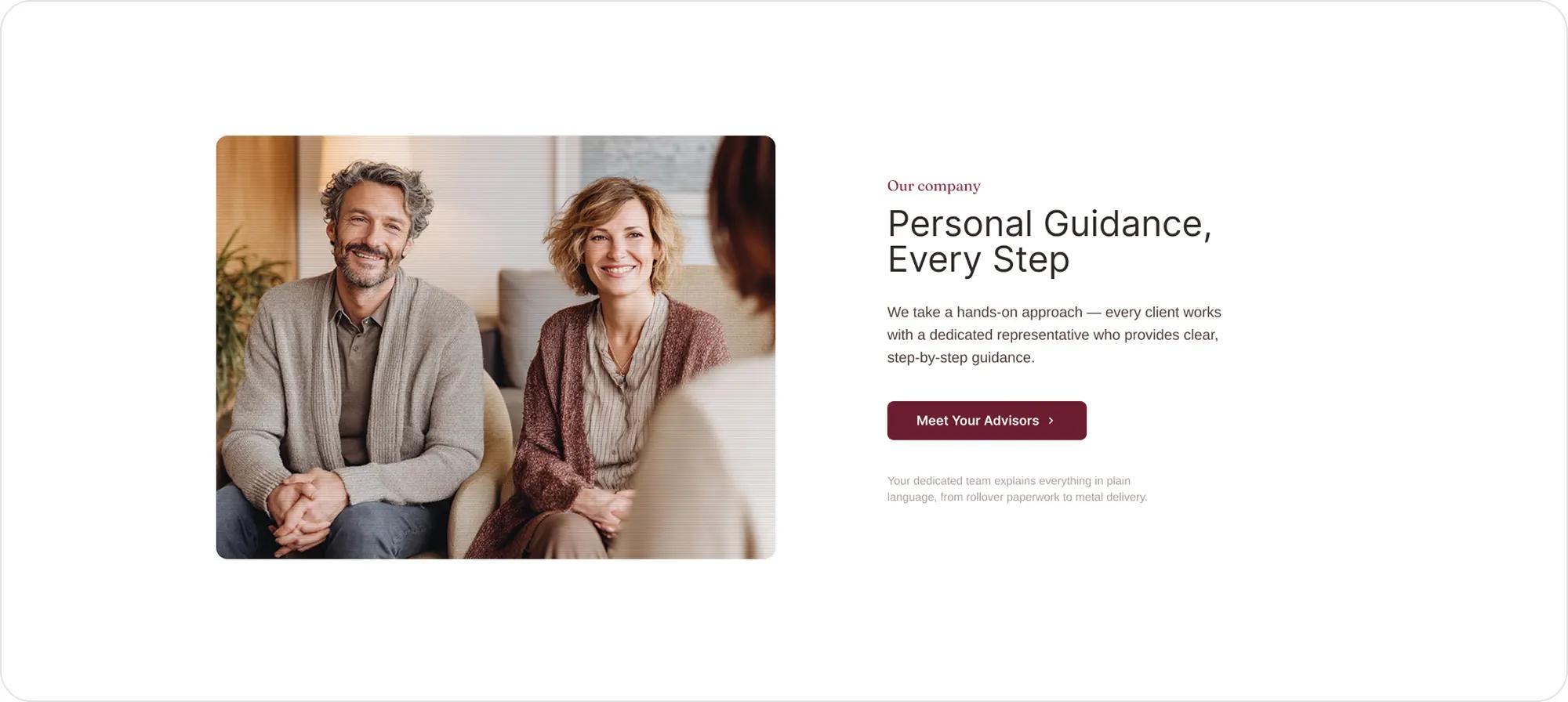
Photography that feels real
Real, warm photography instead of stock finance imagery an older couple, an advisor with a genuine expression builds the same trust cues a client would look for in an in-person meeting.
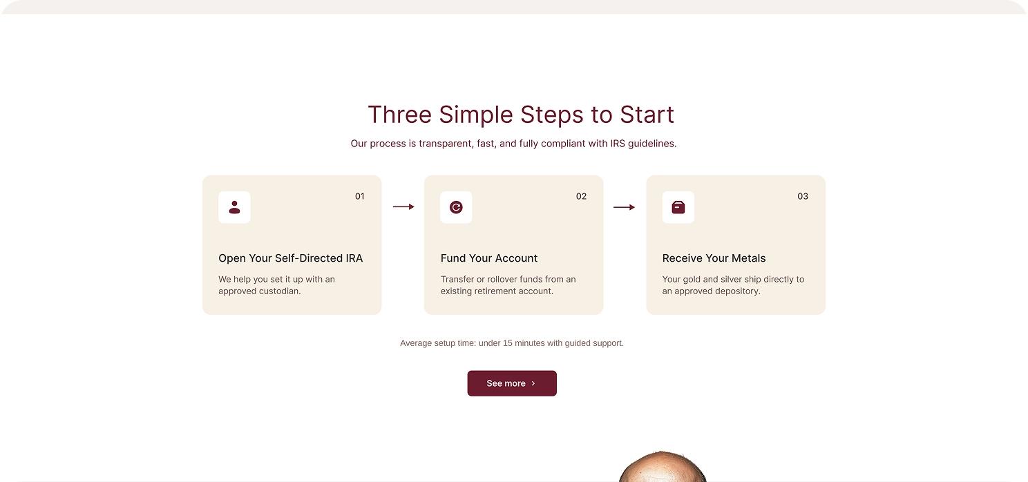
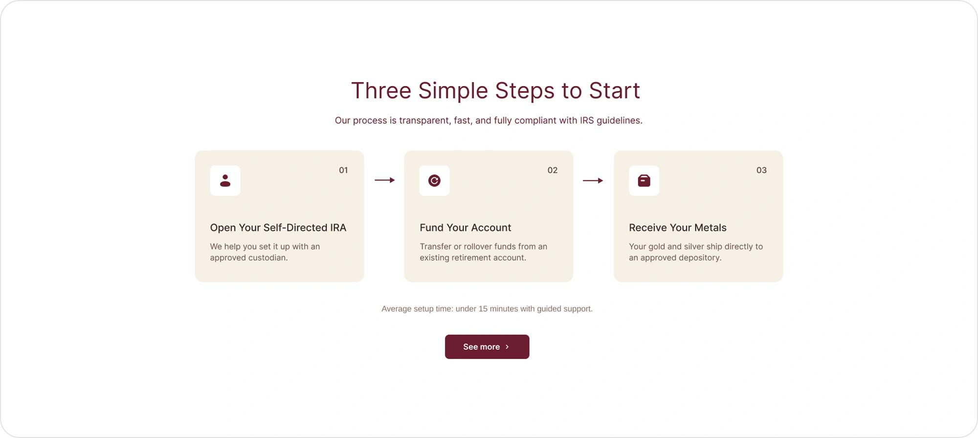
A three-step process
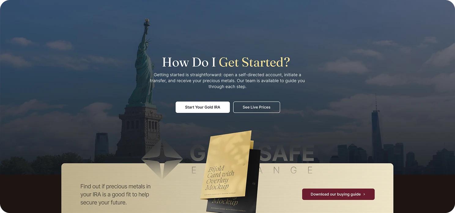
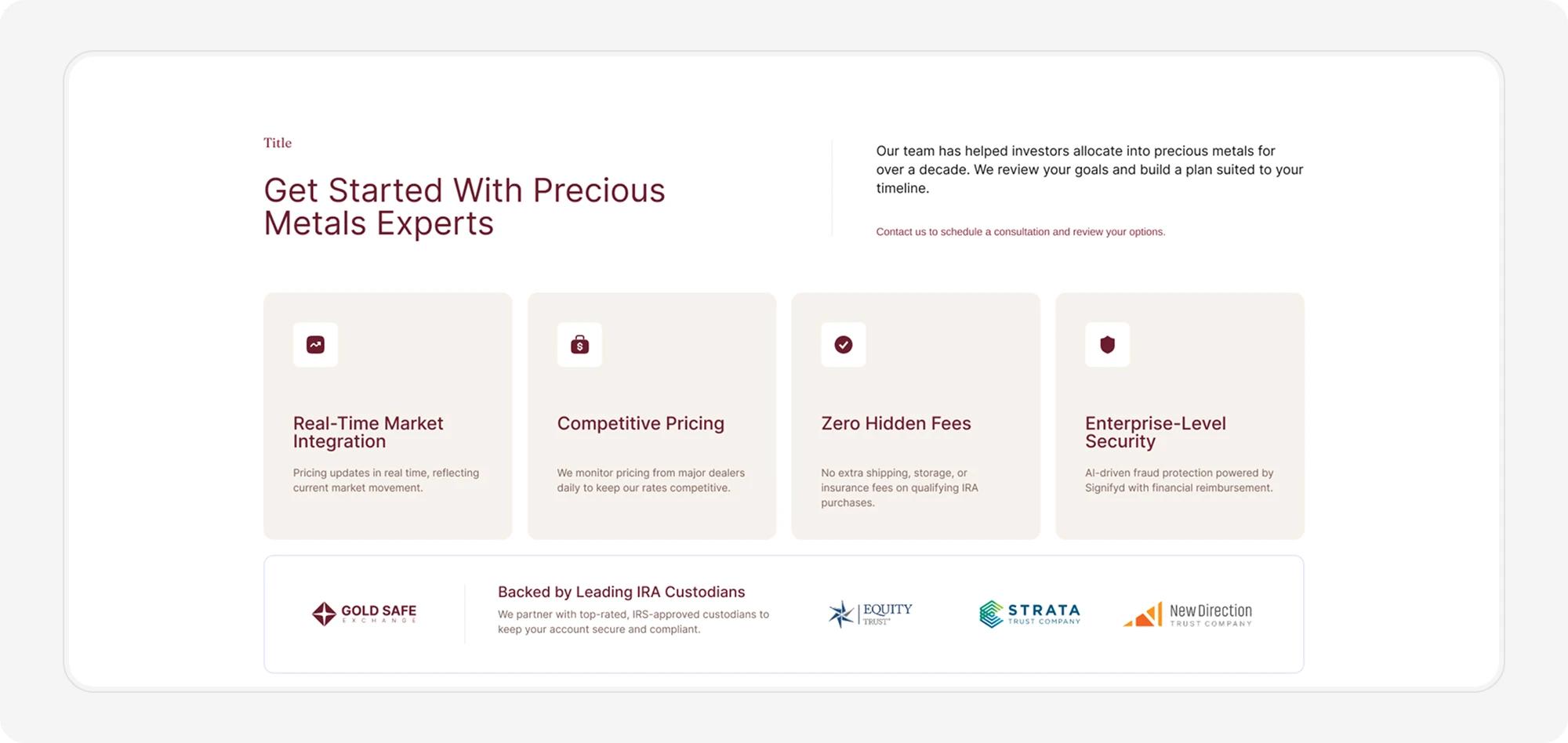
A three-step process breakdown demystifies IRA rollovers, the single biggest point of friction for first-time buyers.
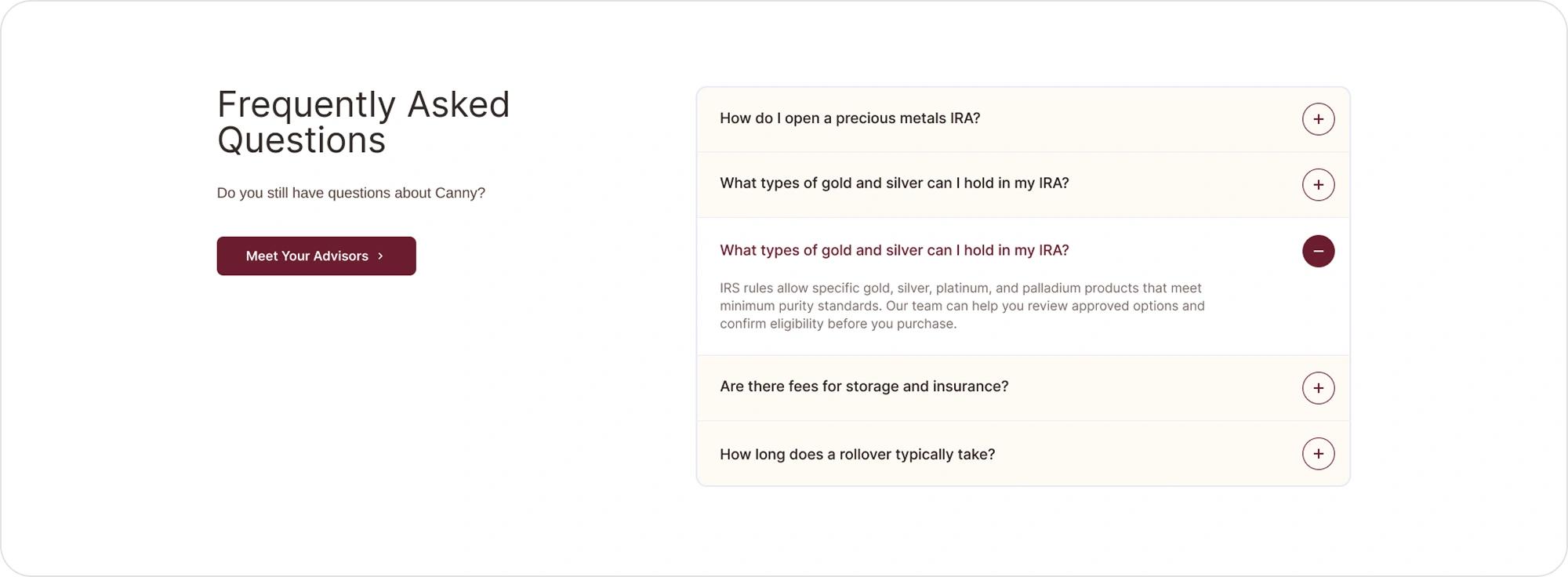
Objection-handling FAQ
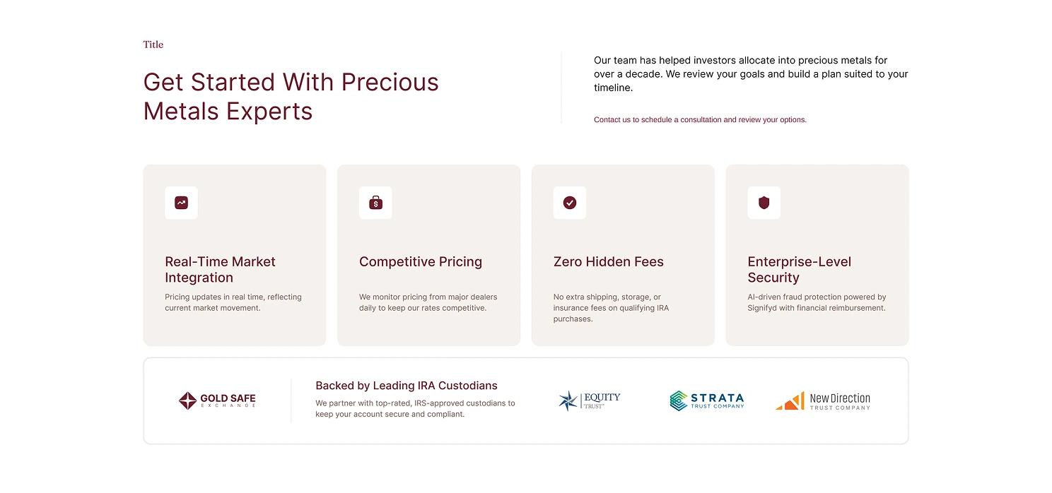
FAQ and objection-handling content sits directly beneath the trust signals, answering the questions a skeptical visitor is already asking themselves.
At a glance
The five decisions above, in one line each:
- Live price ticker transparency before a word of copy
- Lead form above the fold low-friction first contact
- Real photography human trust cues, not stock imagery
- Three-step process demystifies the IRA rollover
- FAQ answers objections before they're asked
Design System
Every color and text style used across the homepage was consolidated into a reusable Figma library, so the visual language stays consistent as the site grows into IRA product pages, blog content, and marketing landing pages.
What's included
The library ships with:
- 29 reusable color styles Primary, Neutral, Background, and Component groups
- A full text style library Display, H1–H6, plus body, meta, eyebrow, and list styles
- Every fill, stroke, and text layer on the homepage bound directly to a style, not a raw value
Outcome
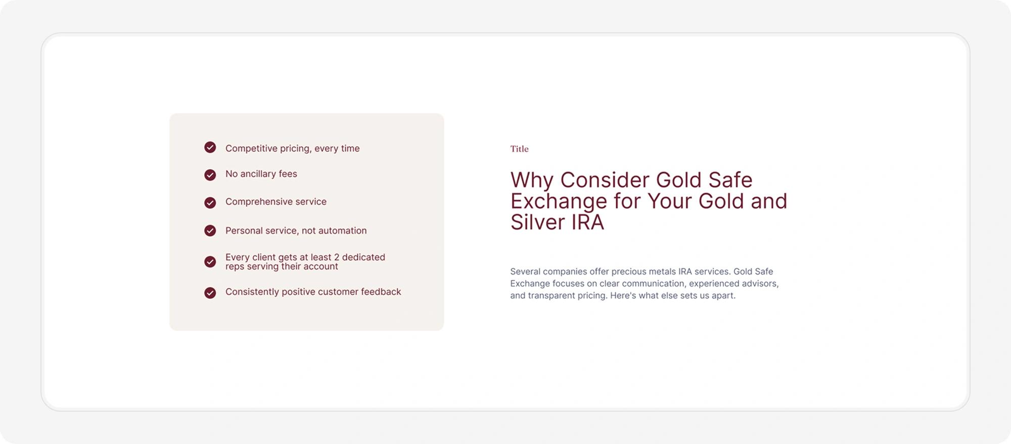
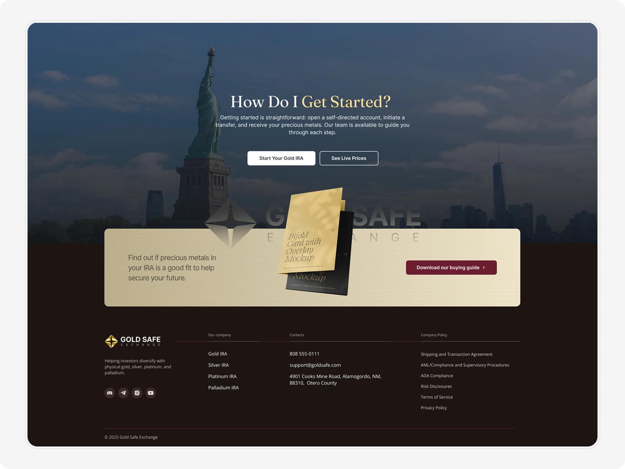
The result is a homepage that reads less like a sales funnel and more like a well-run advisory office: calm, credible, and structured around the questions a cautious investor actually has.
Client feedback
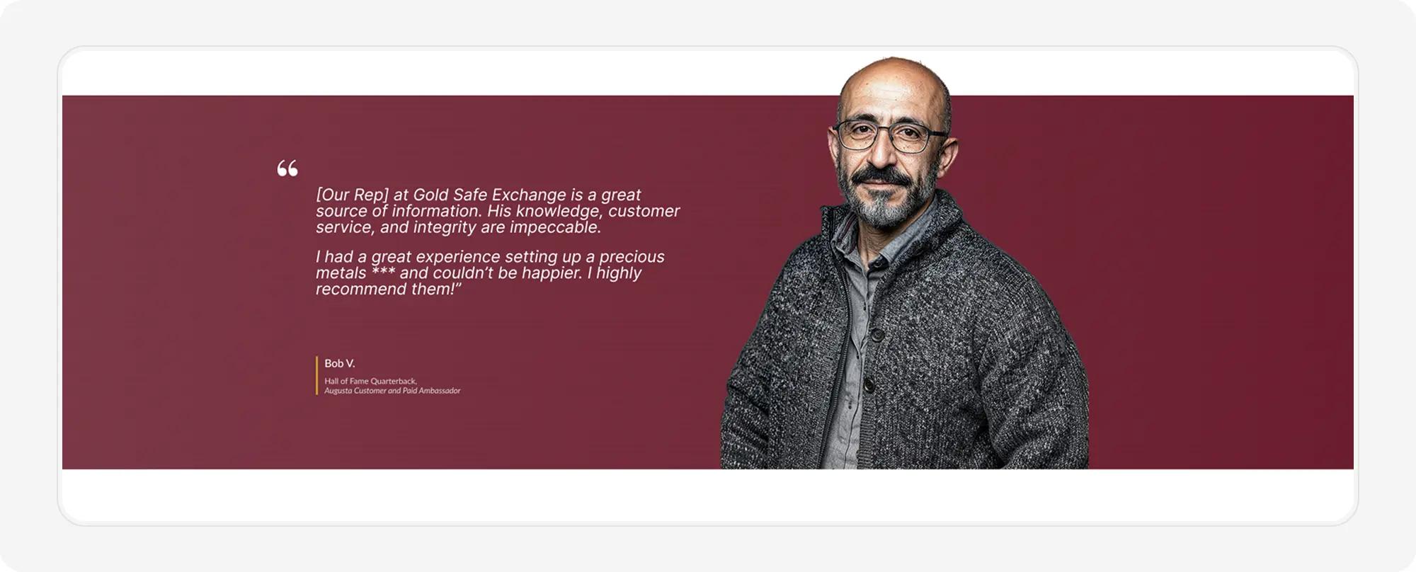
One recent customer summed it up best:
Customer review
What impressed me most was how a genuinely long, multi-step process — registration, diagnostics, and a full learning plan — never felt overwhelming. Every screen just made sense.