Tracewell - AI SaaS Platform & B2B Website Design Case Study
How we designed Tracewell, an AI SaaS platform for enterprise workflow and revenue recovery: from competitor research to landing page, dashboard, and mobile app design.



3months
Launch time
6
AI agents deployed
340+
Leaks detected per month
SOC 2
Compliance standard supported
Tracewell: an AI SaaS platform for enterprise workflow recovery
Tracewell is an AI SaaS platform built for operations and finance teams at mid-market and enterprise companies. It connects to a team's existing tools, traces exactly where time, revenue, and attention are being lost across disconnected workflows, and deploys AI agents to close those gaps automatically, with a full audit trail for compliance and governance.
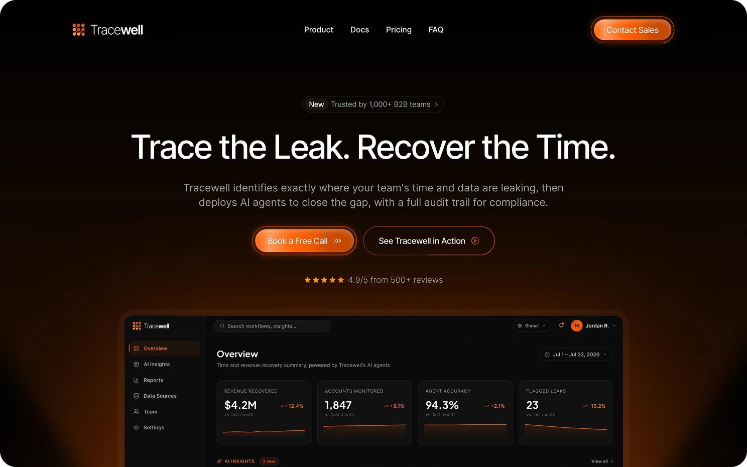
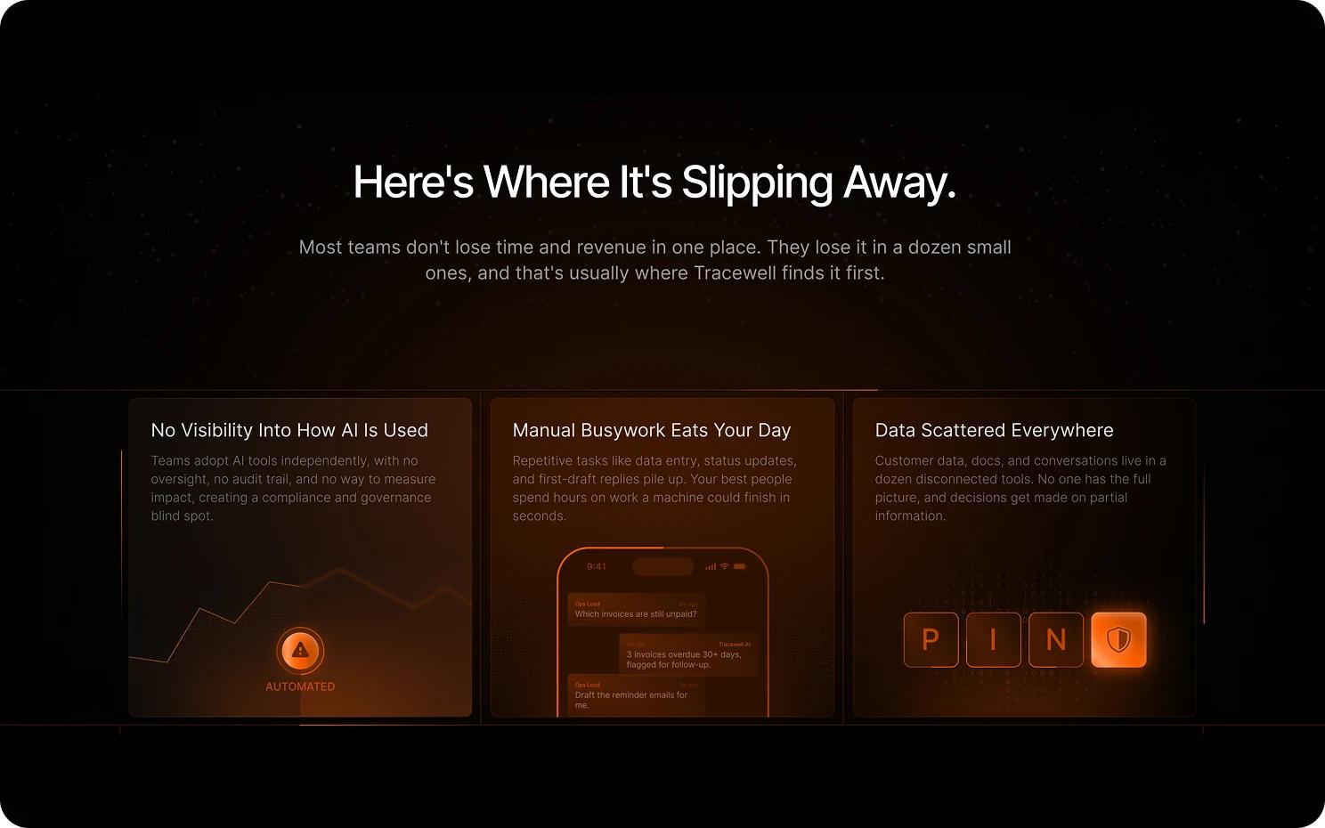
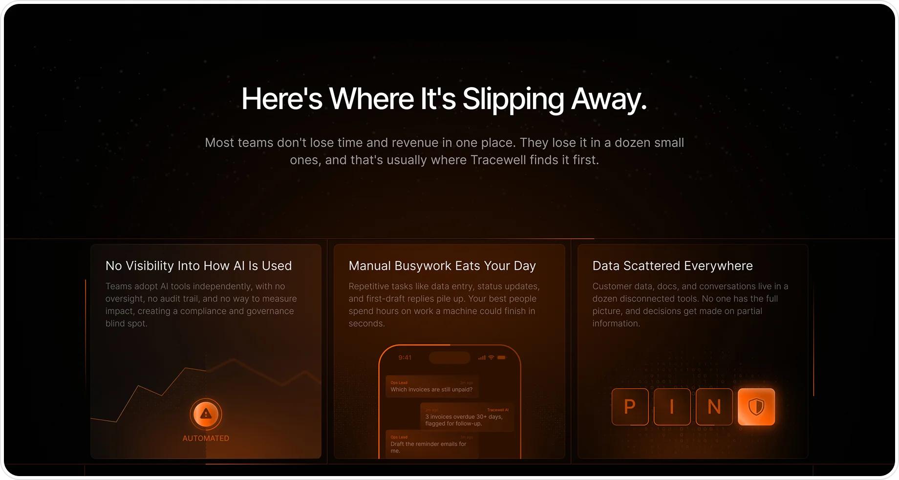
Three ways enterprise teams lose time and revenue
- Data Scattered Everywhere
- Manual Busywork Eats the Day
- No Visibility Into AI Usage

Designing the Tracewell website, dashboard, and mobile app
A conversion-focused B2B SaaS website design paired with the product itself: a dark, data-dense dashboard and a lightweight mobile companion, all sharing one visual language and design system.
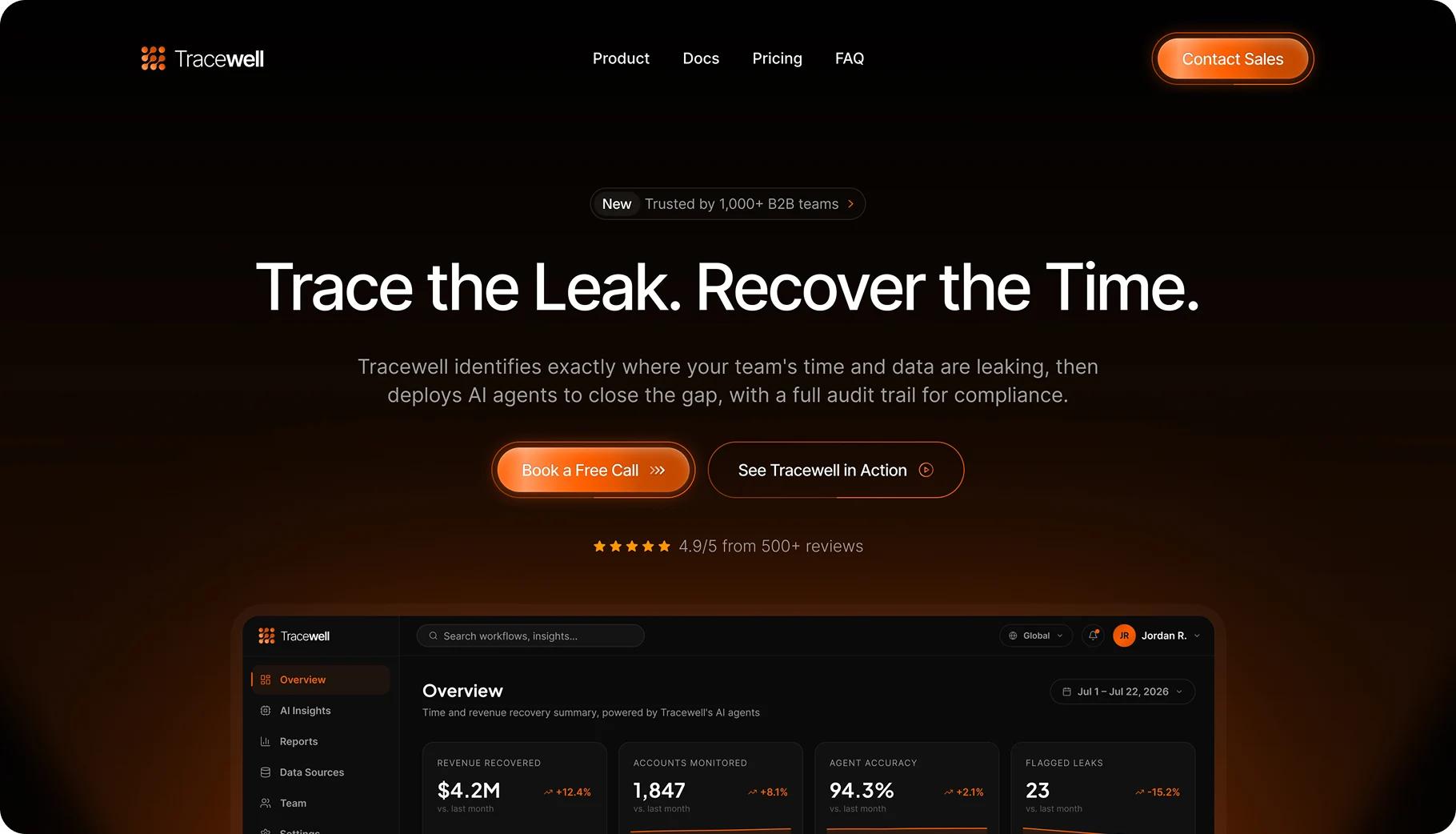
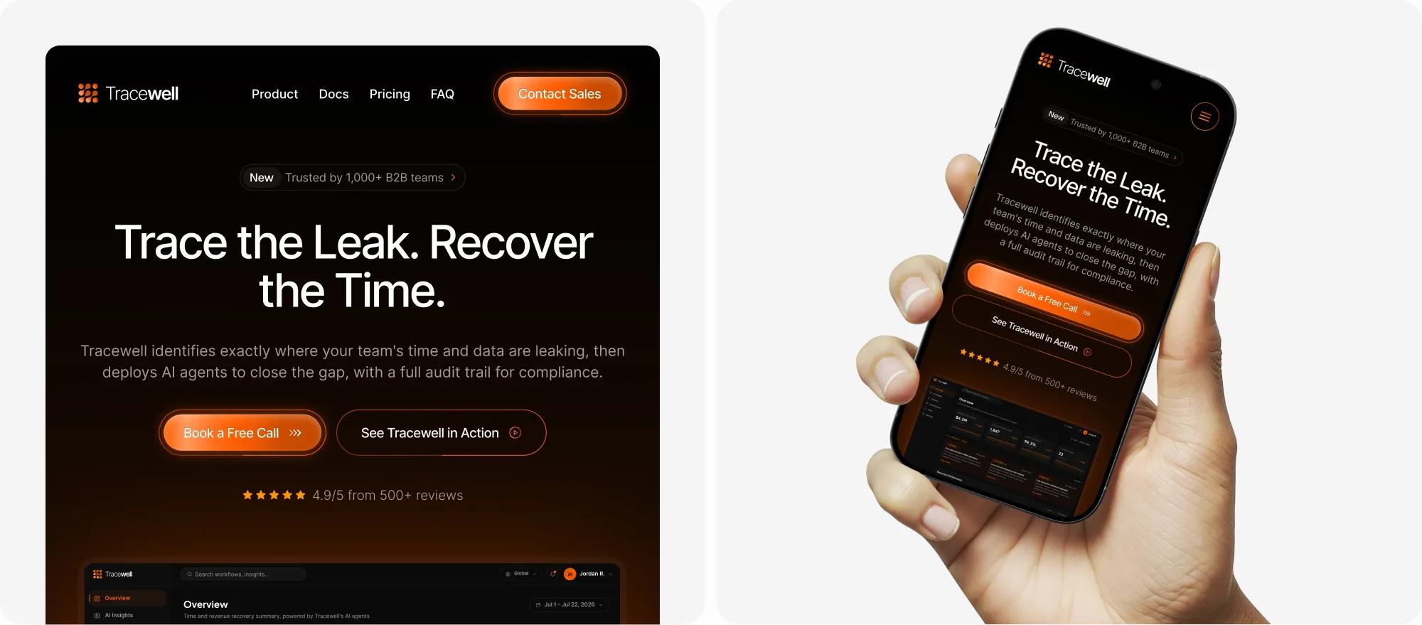
Hero Section
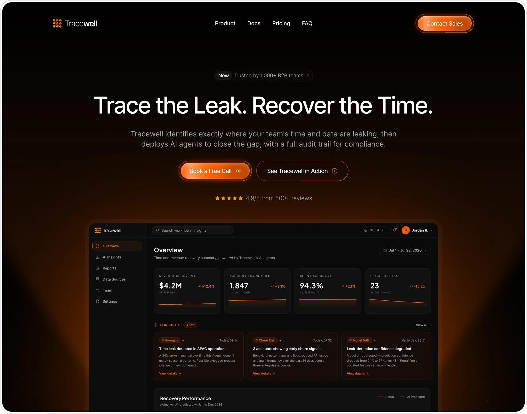
The hero leads with a short, outcome-driven headline instead of a category label, the same pattern found across Cohere, Hex, and Notion during the competitor audit. A live product mockup sits inside the hero so the value proposition feels concrete within the first second, and the press bar underneath borrows its social-proof placement from Retool and Jasper.
- Outcome-driven H1 (3–7 words), no "AI-powered" category framing
- Live product mockup embedded directly inside the hero, not below it
- Press/logo bar for social proof placed right under the fold
- Dual CTA: primary "Book a Demo" + secondary "Get a Quote"
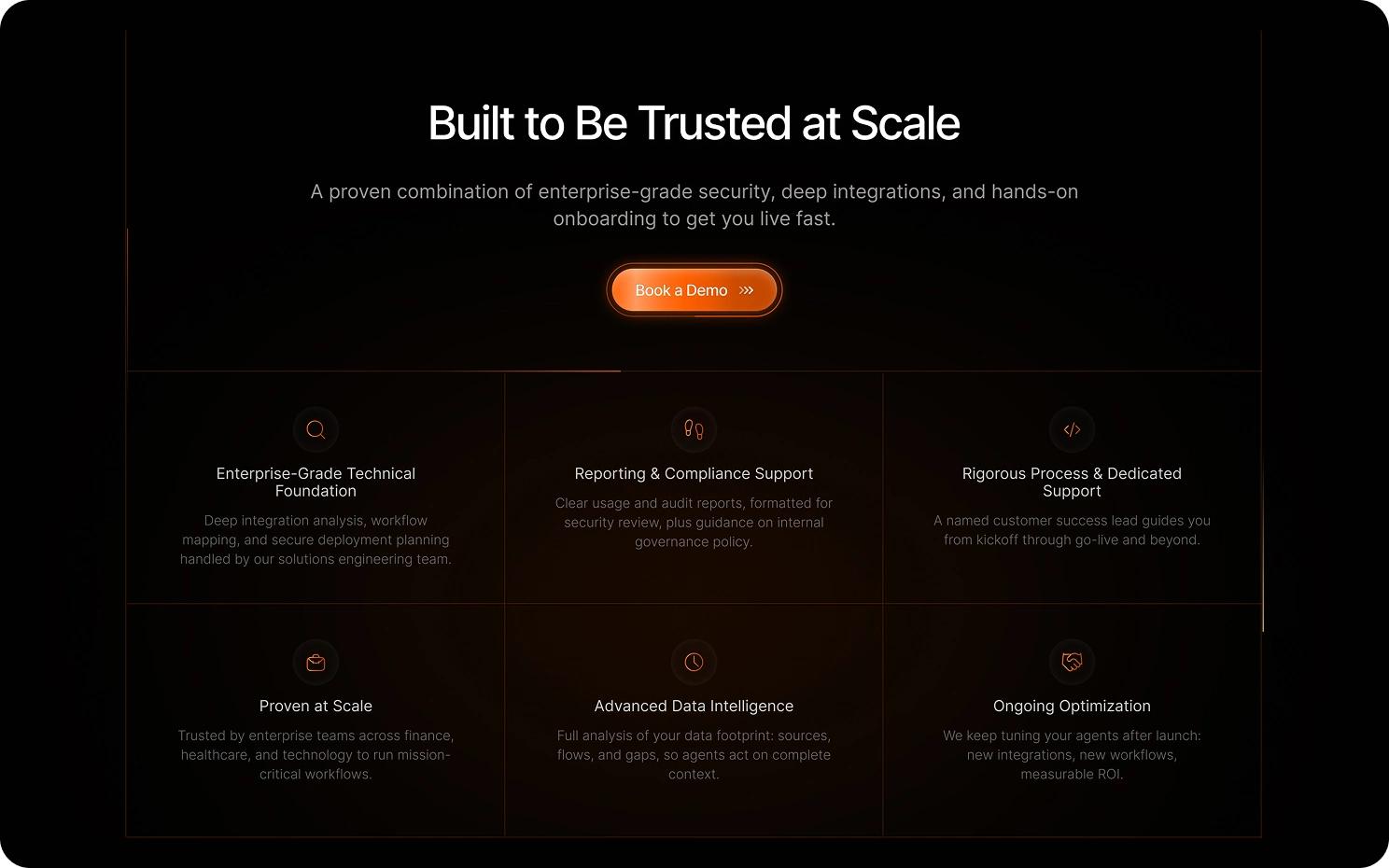
Security copy leads with named certifications (SOC 2 Type II, GDPR, ISO 27001) instead of a generic "enterprise-grade" claim, since specificity is what security reviewers actually search for.
How It Works & Testimonials
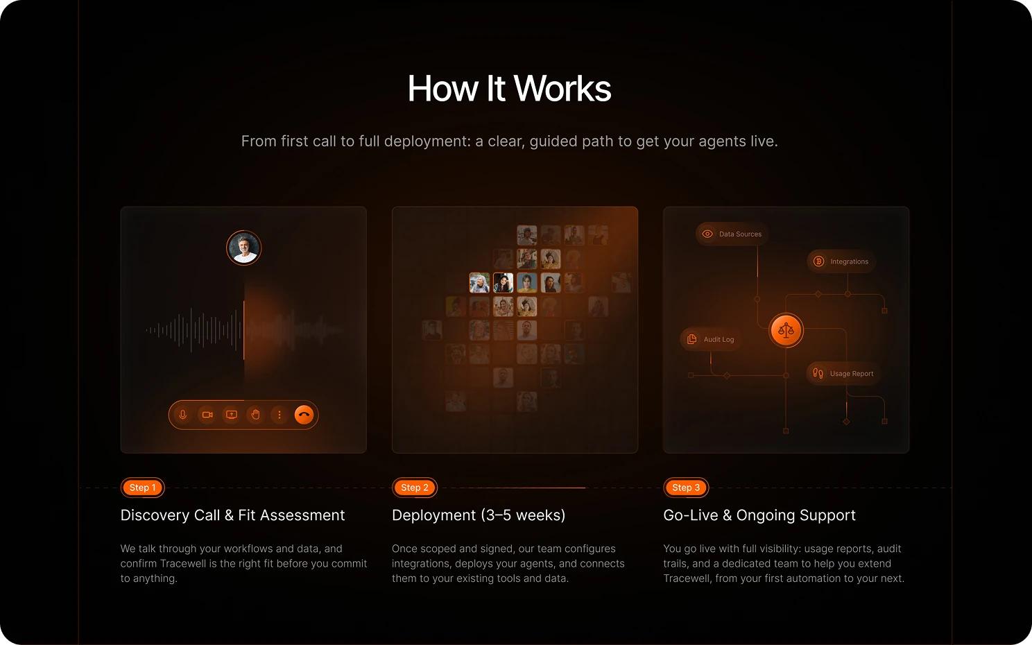
A three-step process (Discovery Call, Deployment, Go-Live) sets expectations before the final CTA, addressing an enterprise buyer's need to understand implementation effort up front. Testimonials are attributed to a named person, title, and company rather than left anonymous, following the credibility pattern used in Notion and Jasper's trust sections.
- 3-step numbered process with a concrete time estimate (3–5 weeks)
- Mini timeline preview in the trust section mirrors this same process
- 4 testimonials, each attributed to a name, title, and company
- Contact form placed directly beneath testimonials to capture warm intent
The 3-step timeline reappears in miniature earlier on the page, inside the trust section, so returning visitors recognize the same process before they reach this section.
Product Dashboard - Overview
The dashboard reuses the marketing site's brand color and dark theme so the shift from 'ad' to 'product' feels seamless. Metric cards lead with the outcome the product promises (Revenue Recovered, Flagged Leaks) instead of generic analytics labels, and an AI Insights feed surfaces anomalies proactively rather than waiting for the user to go looking for them.
- 4 top-line metric cards: Revenue Recovered, Accounts Monitored, Agent Accuracy, Flagged Leaks
- AI Insights feed with severity-coded badges (Anomaly, Churn Risk, Model Drift)
- Recovery Performance chart plotting Actual vs. AI-Predicted values
- Client Monitor table with a per-account AI Score and status
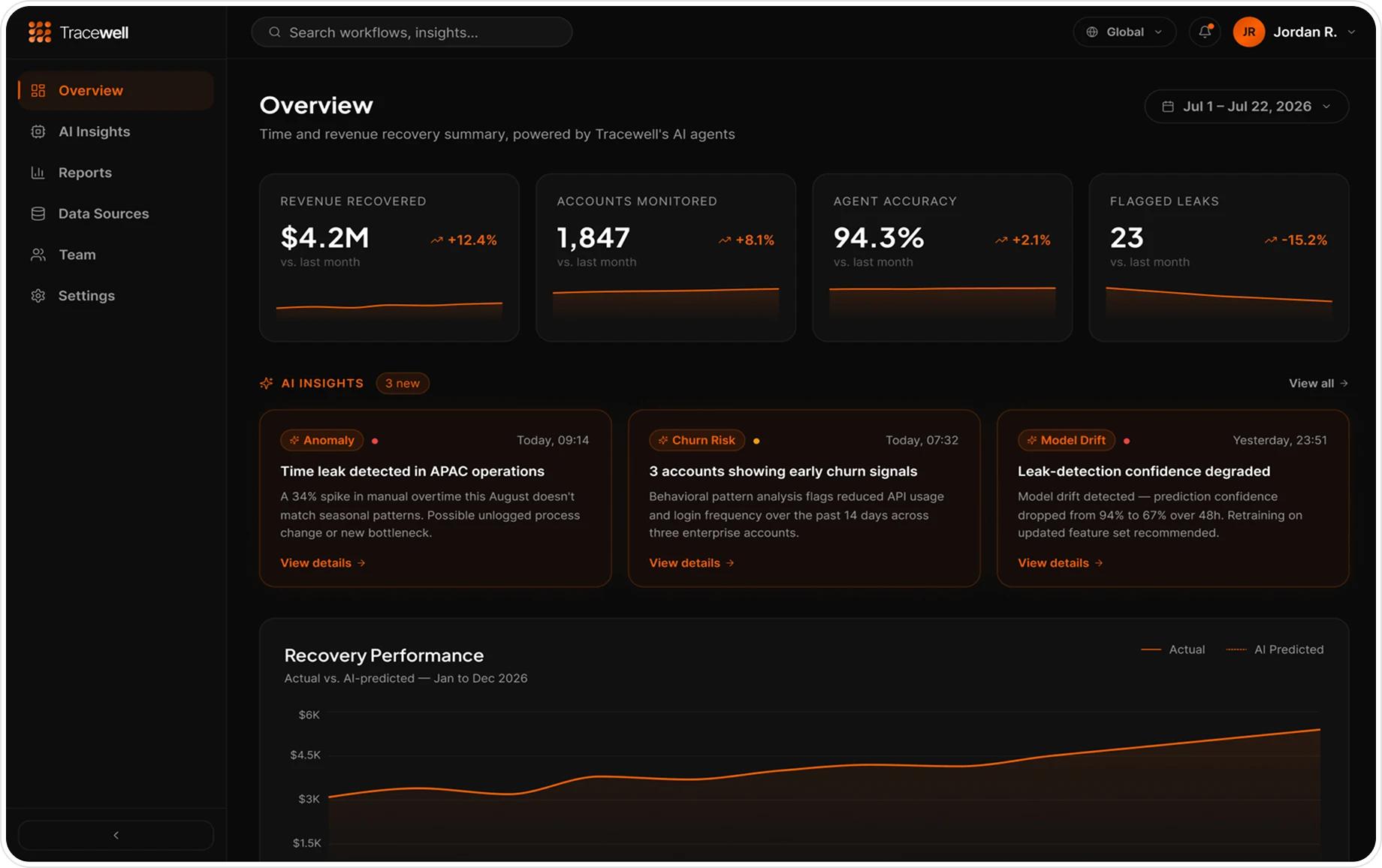
The AI Score column follows a 3-tier color system: brand orange for high scores, amber for medium, red for flagged accounts, so risk is scannable without reading every row.
Mobile App - Onboarding Flow
A lightweight companion view built for on-the-go status checks, not a full re-implementation of the dashboard. Chat-style bubbles let users ask about specific numbers in plain language, extending the product's agent concept into a conversational surface instead of a shrunk-down data table.
- Chat-style bubble UI for natural-language status queries
- Native iPhone status bar and frame for a realistic device context
- Two-button footer pairing a primary and a secondary action
- Compact metric summary mirroring the desktop dashboard's key numbers
Business impact: how the design supports enterprise growth
Tracewell is a concept project, so these are the targets the design was built around rather than reported results, the same benchmarks an enterprise SaaS site and product are typically measured against post-launch.
The pricing and trust sections exist specifically to shorten an enterprise sales cycle: a single custom-quote plan removes the friction of a public price ladder, and the SOC 2/GDPR/ISO block sits next to price so security review can start before the first call. The dashboard and mobile app extend the same brand and vocabulary past the landing page, so a prospect who books a demo sees a product that already looks like the site that convinced them.
Design reflection: why cross-platform consistency matters
The hardest part of this project wasn't any single screen, it was making the marketing site, the product dashboard, and the mobile app feel like they came from the same team. Auditing competitors' heading structures gave the copy a clear system to follow, and tying every surface back to one brand color and one type scale kept the product feeling coherent as it grew from a landing page into a full product.
Customer review
What impressed me most was how a genuinely long, multi-step process - registration, diagnostics, and a full learning plan - never felt overwhelming. Every screen just made sense.